MEM Rigs and Hoists Dashboard
May 2025
Designing a real-time contract monitoring tool for Oman's oil and gas sector.
- Role
- Product designer
- Team
- Product designer, project manager, front-end developer, back-end developer
- Timeline
- Initial prototype in two weeks, followed by continued product development
- Client
- Ministry of Energy and Minerals, Oman
A little about me
I am a product designer with a background in industrial engineering. That background shapes how I approach unfamiliar and operationally complex products. I first learn how the system works, identify the decisions people need to make, and then design the interface around those decisions.
This project placed me inside a domain I knew very little about: rigs, hoists, oil and gas contracts, and workforce planning.
The brief
The Ministry of Energy and Minerals approached Rihal with a request from its In-Country Value team.
The team needed real-time visibility into rig and hoist contracts across Oman's oil and gas sector. Contract information existed, but it needed to be centralized and presented in a way that supported faster monitoring, proactive workforce planning, and better operational decisions.
The immediate request was unusually ambitious. MEM wanted a bespoke dashboard that could be presented at a major industry symposium within two weeks.
It also needed to become a product the team could continue using after the event.
That created two parallel goals:
Build something polished enough for a public showcase, while creating the foundation for a practical operational tool.
Learning the system before designing it
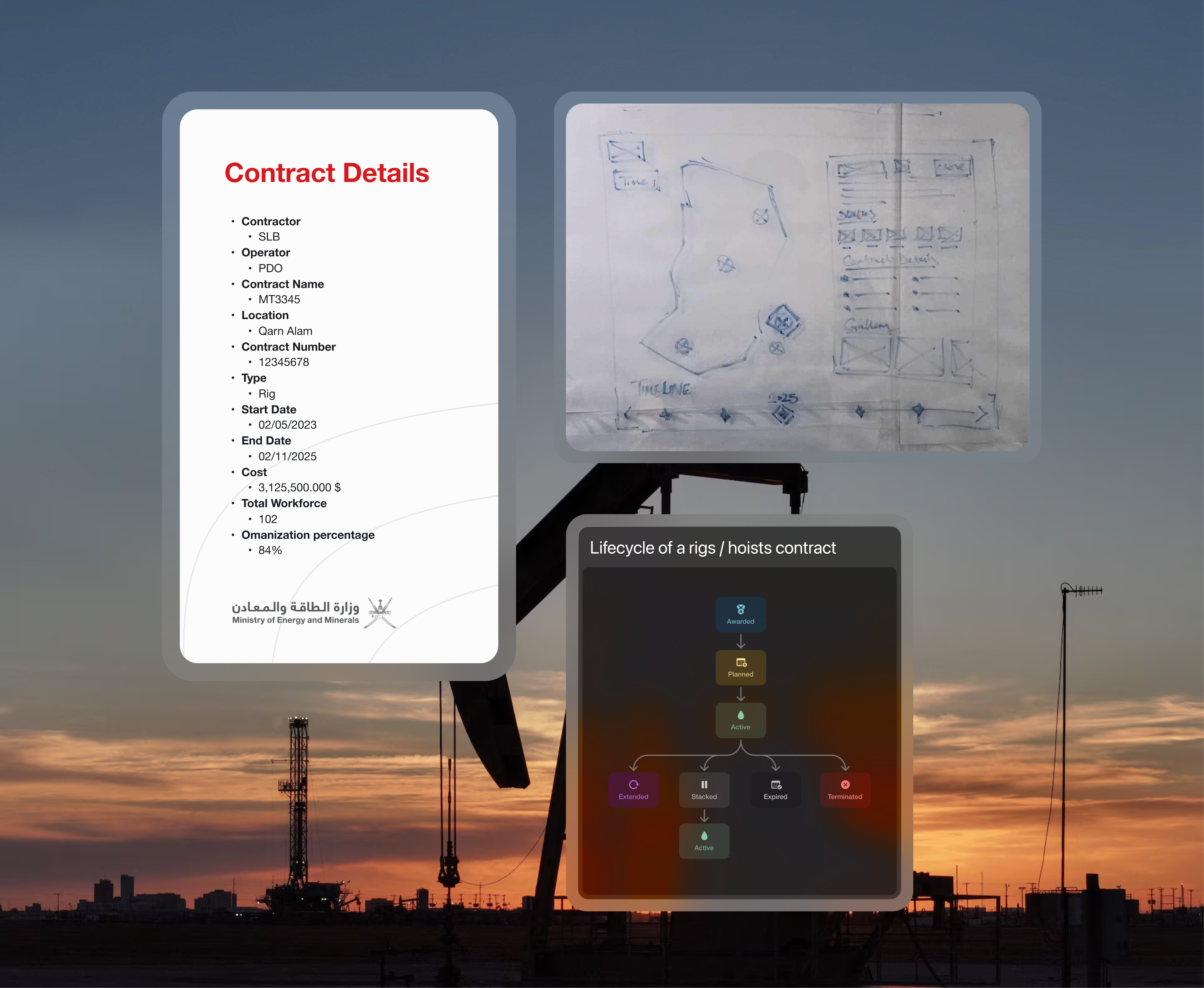
Before exploring layouts, I needed to understand the information behind the interface.
I reviewed sample contracts with the team and mapped the fields MEM needed to monitor. This included contract duration, operator, contractor, location, equipment status, workforce information, and key dates.
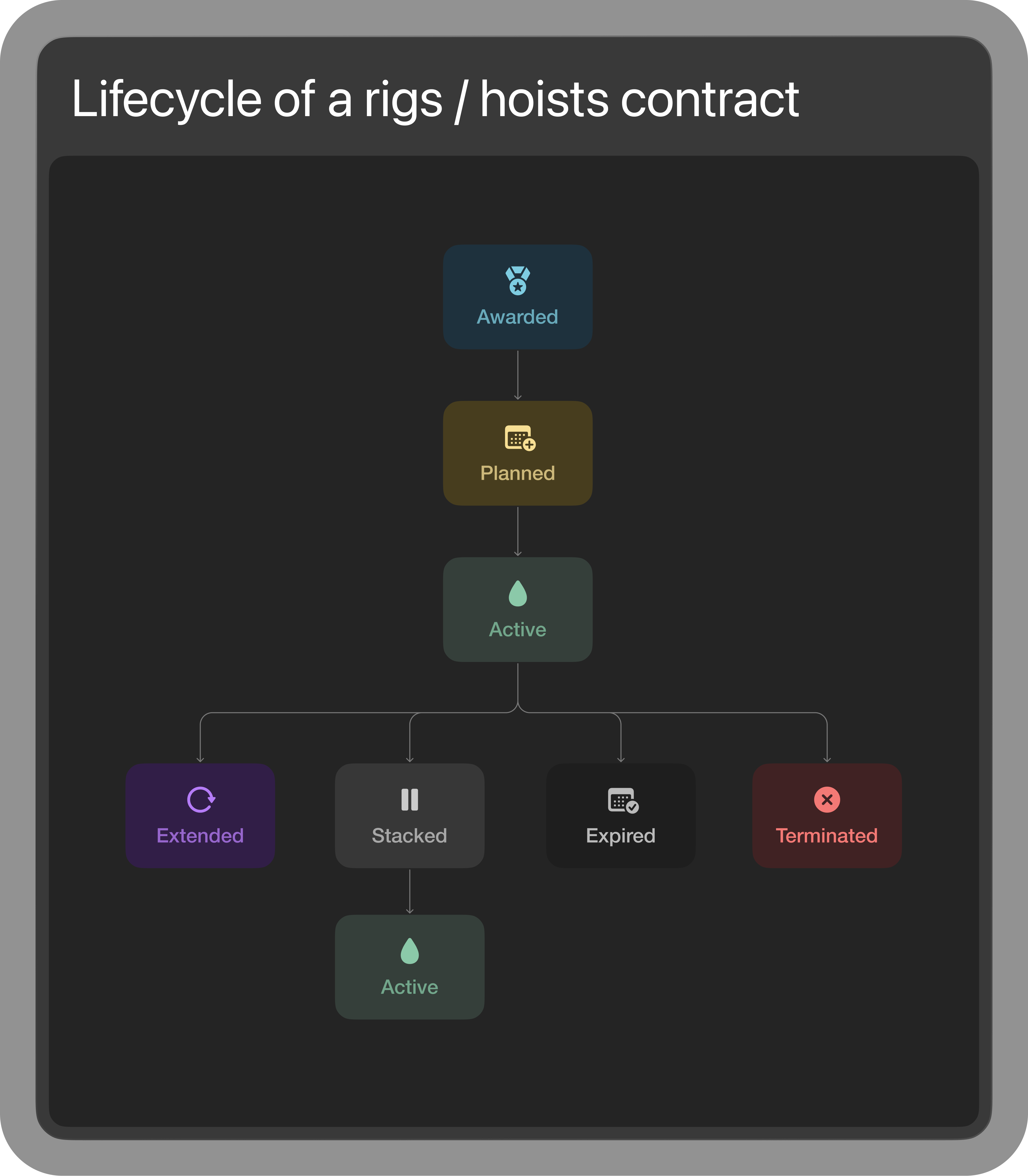
The most important concept was the contract lifecycle.
A rig or hoist contract moves through a series of stages. These stages influence when equipment becomes active, when a contract may end, and when workers could become available for another project.
For MEM's ICV team, this was more than a status label. It gave them an early indication of where workforce demand might increase or decrease.
The lifecycle became the organizing principle for the dashboard.
Turning the lifecycle into an interface
Once the underlying process was clear, I began sketching ways to make contract movement visible without forcing users to inspect every record individually.
The early whiteboarding focused on three questions:
How can someone understand the overall state of the sector at a glance?
How can they move from a national overview to a specific contract?
How can the interface make changing contract states easy to recognize?
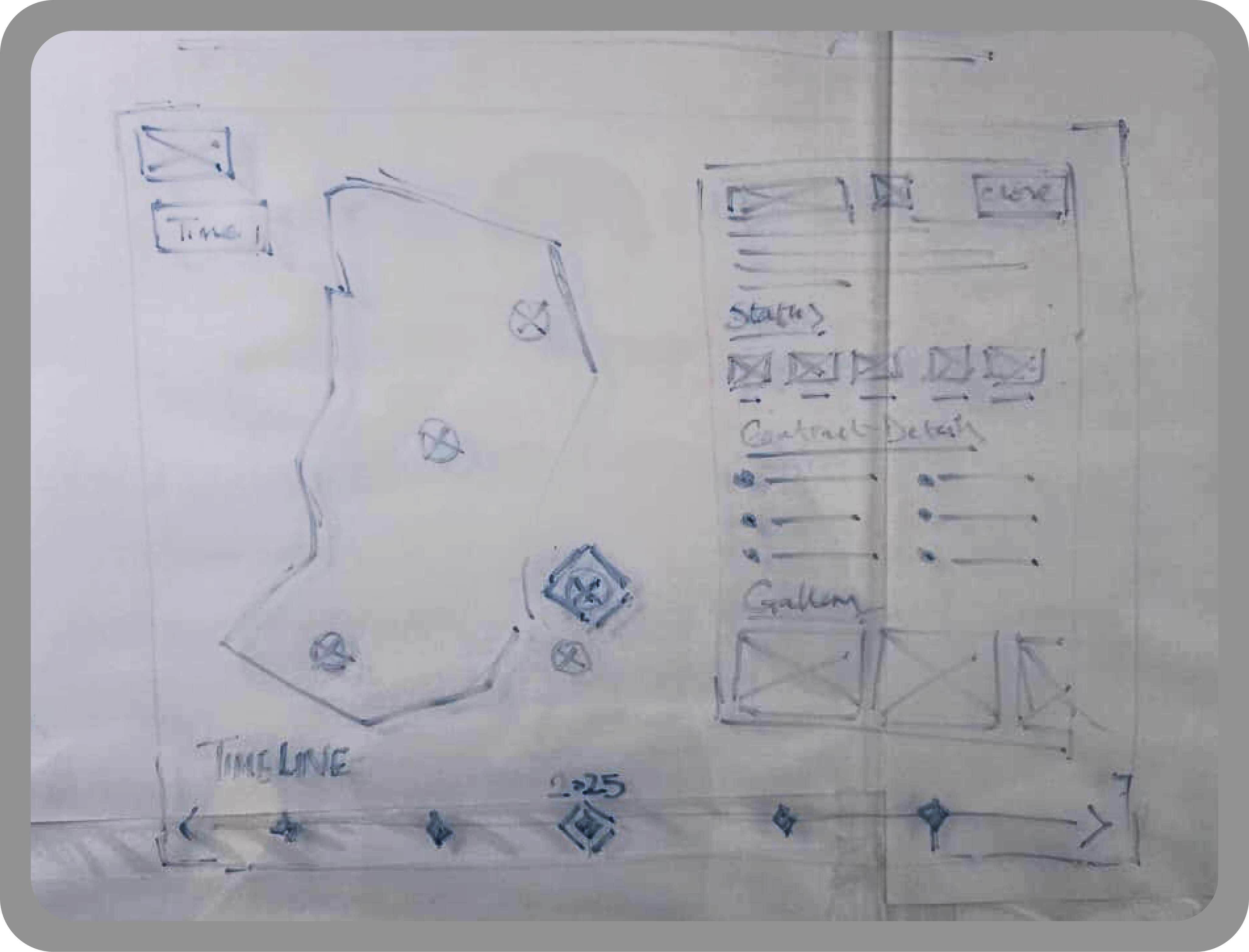
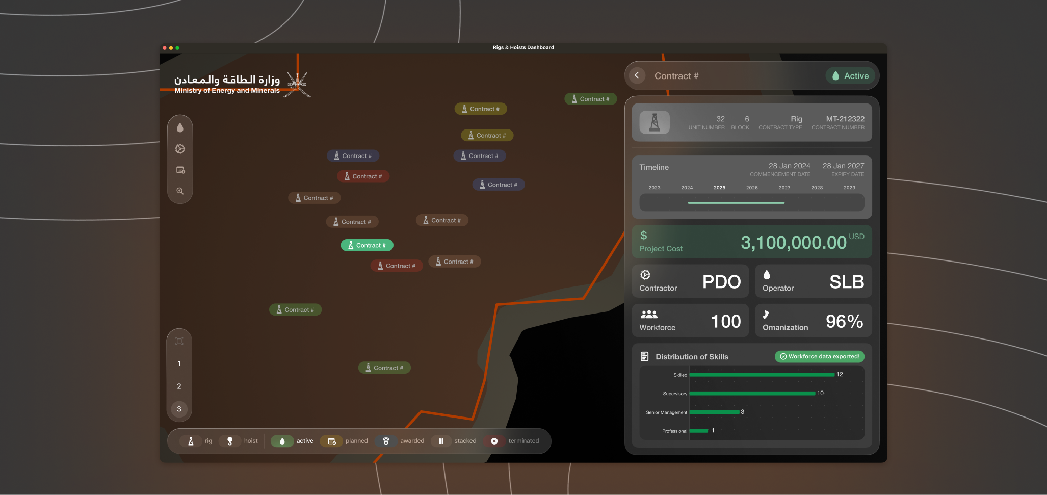
These explorations helped establish the dashboard's basic structure: a geographical overview, lifecycle filters, summary metrics, and a persistent information panel for contract-level actions.
Establishing the direction quickly
The first screens were created early enough to give MEM confidence in the direction and give the development team a tangible view of what we were building.
They were not intended to resolve every interaction. Their purpose was to align the client and team around the dashboard's structure, visual language, and level of ambition.
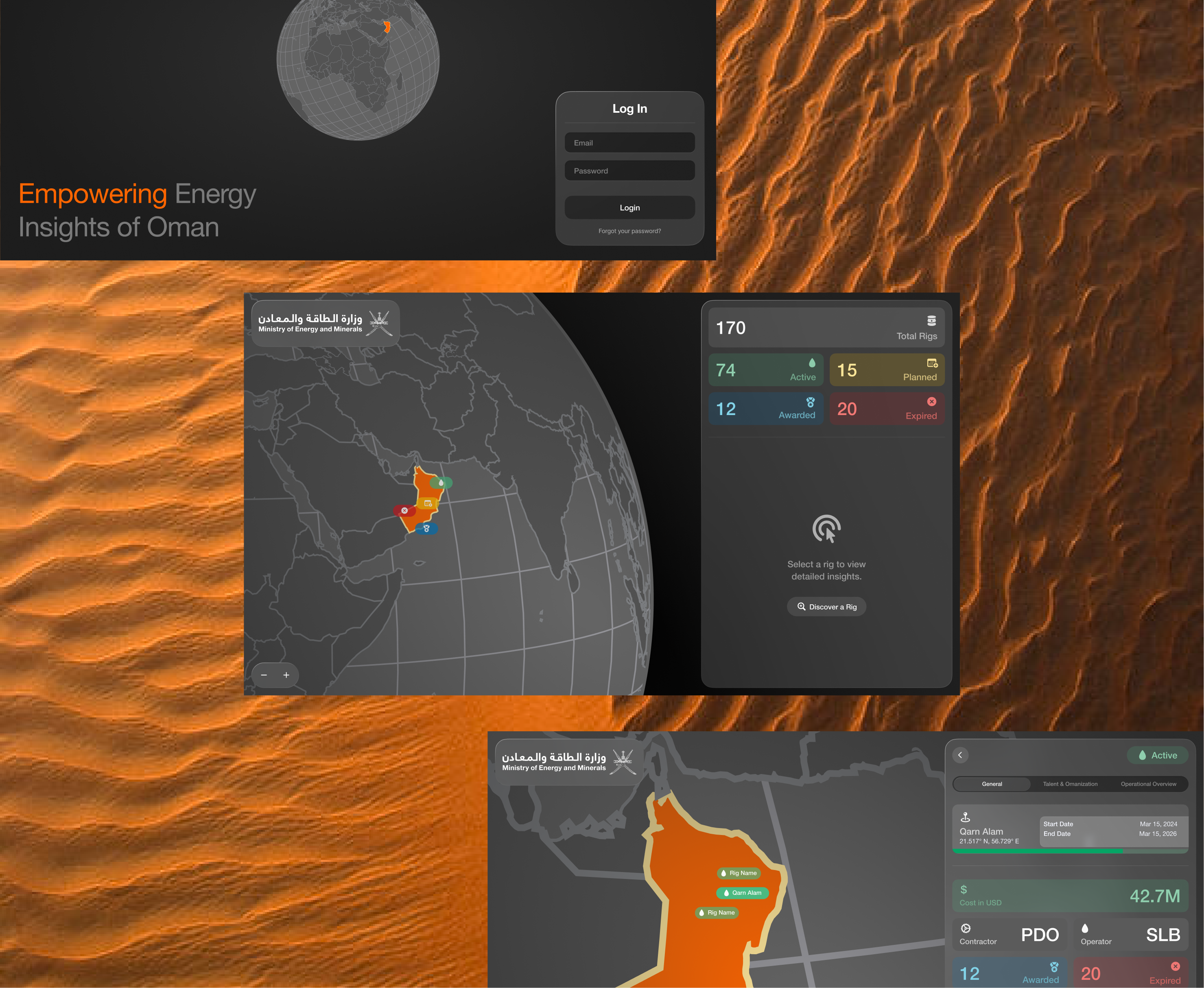
The early designs helped us secure approval on the direction and gave the developers a clearer picture of the expected experience before implementation began.
Designing for clarity without making it feel ordinary
MEM wanted the dashboard to feel bespoke and premium, not like a conventional administrative system.
I developed a visual direction influenced by visionOS. Translucent surfaces, soft blur, rounded containers, and layered depth helped separate information without filling the screen with heavy borders.
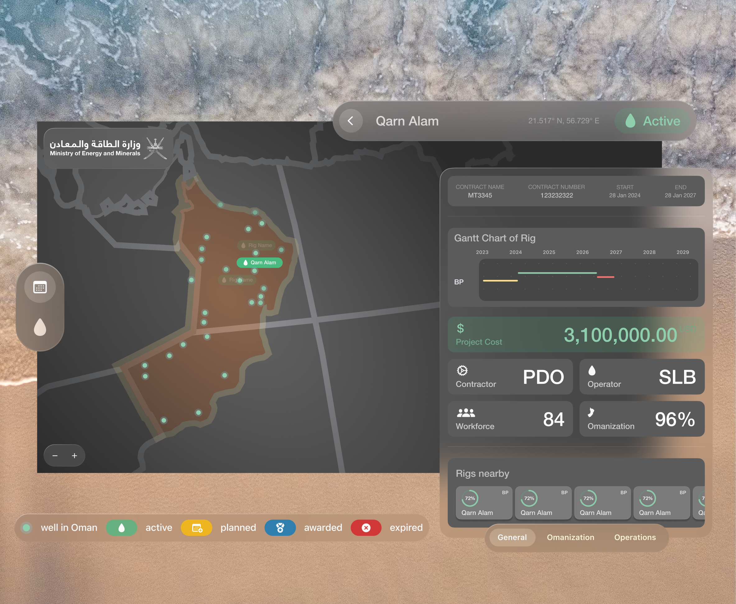
The intention was not to reproduce an Apple interface. It was to use depth and surface treatment to create hierarchy while keeping dense contract information readable.
The interface still needed to work as an operational dashboard. Visual polish could not interfere with comparison, filtering, or decision-making.
Making contract states visible
Colour played an important functional role.
Each lifecycle state was given a distinct combination of colour, iconography, and language. This allowed users to identify what was happening without relying on colour alone.
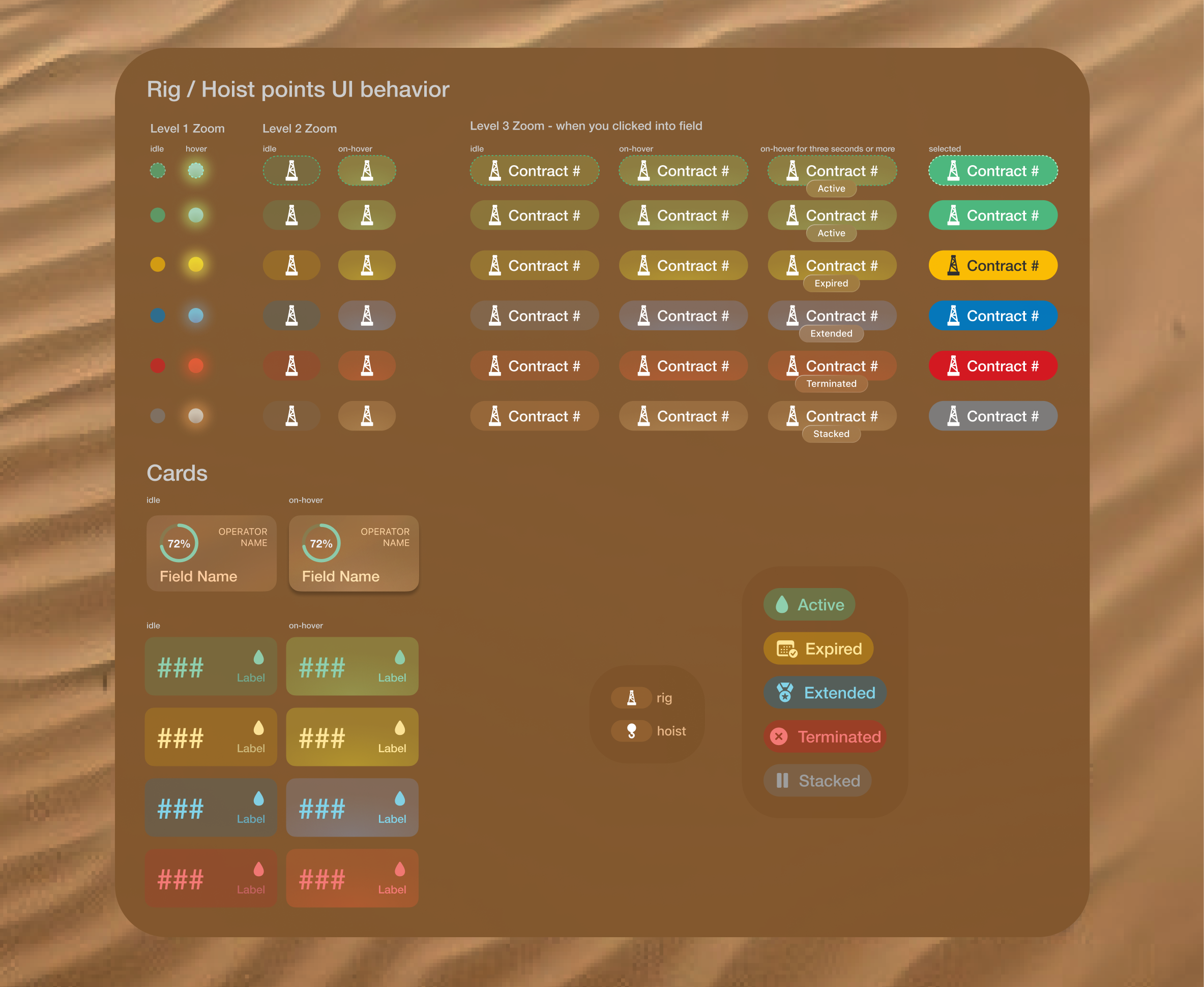
The same state system was applied across filters, map elements, summaries, and contract details. A user could move between different parts of the dashboard without relearning what each state meant.
Creating iconography for a specialist domain
The design relied heavily on SF Symbols because its icons matched the wider visual direction and provided a consistent foundation.
The library did not, however, include many of the specialist objects needed for rigs and hoists.
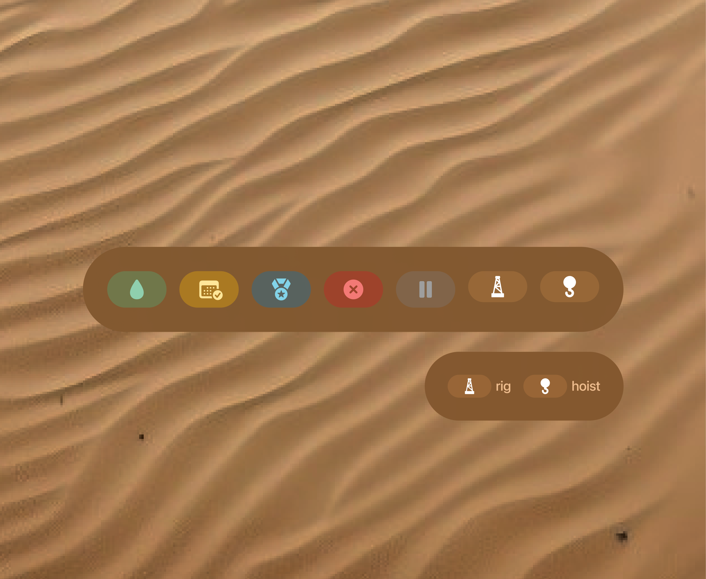
I used ChatGPT's image-generation capabilities to explore icon concepts, then refined the vectors using Figma so they worked alongside the existing symbol library.
This helped us produce domain-specific icons without introducing a second visual style into the interface.
Keeping important information within reach
The information panel became a constant anchor within the dashboard.
Selecting a rig, hoist, block, or contract updated the panel while keeping the user within the geographical context of the main screen.
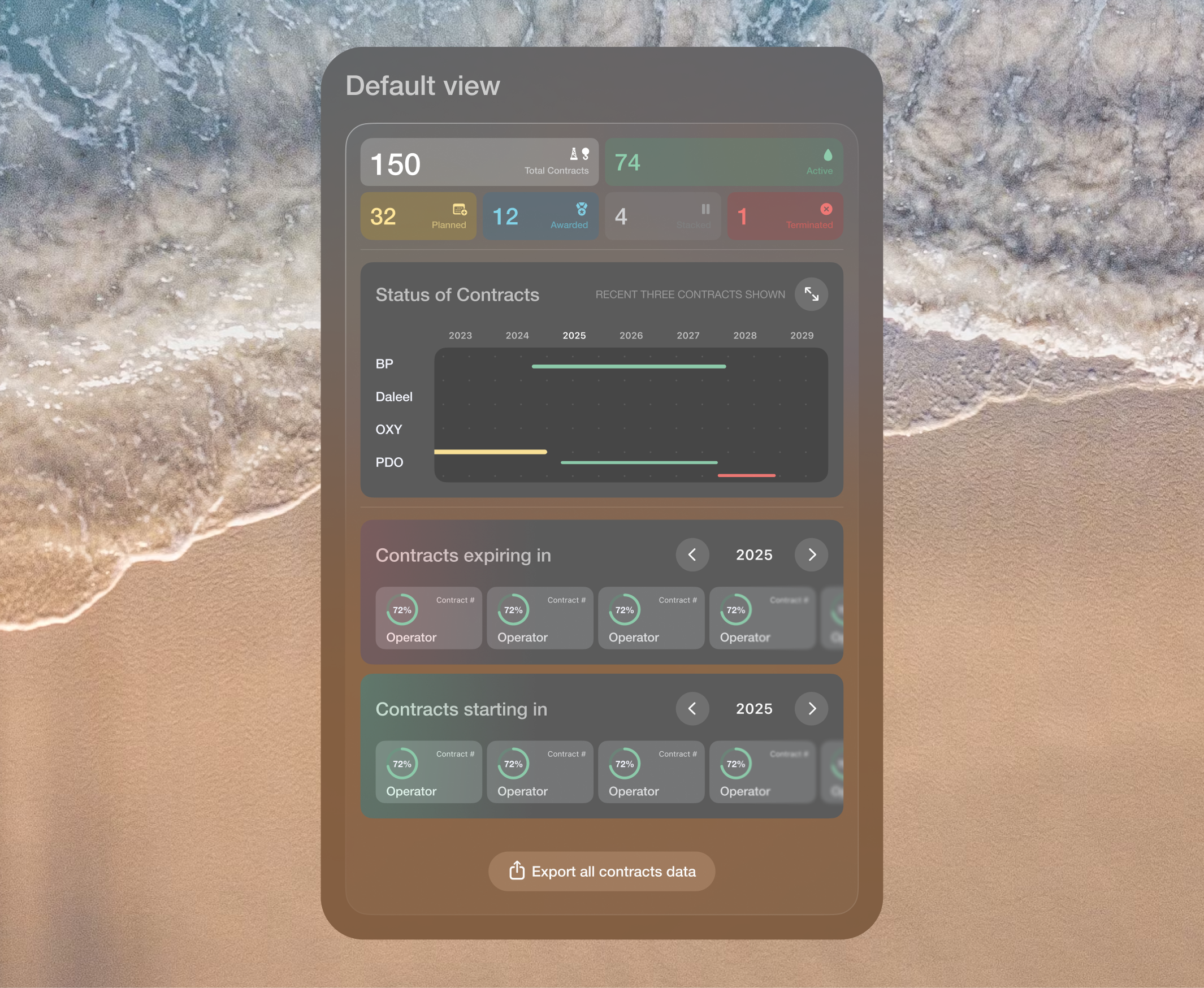
The default state provides a summary of the current view and gives users an immediate place to begin exploring.
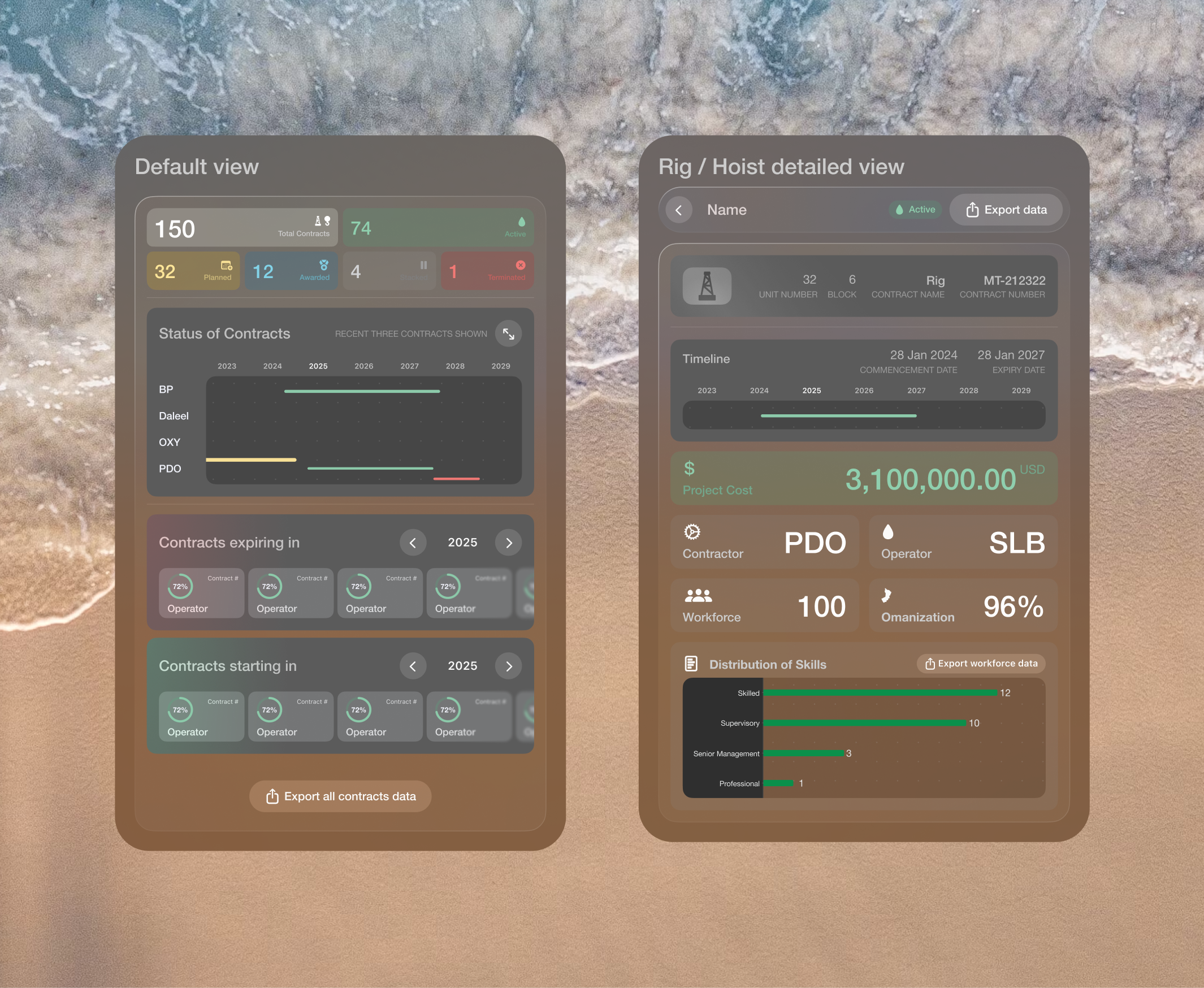
As users move through the dashboard, the panel adapts to the selected object. Its structure remains familiar, but the information and available actions change with the context.
This avoided sending users through separate pages each time they wanted to inspect a contract.
Making Oman's concession blocks interactive
One of the more technically interesting parts of the project was the map.
MEM needed to view oil and gas activity through Oman's concession blocks rather than standard administrative regions.
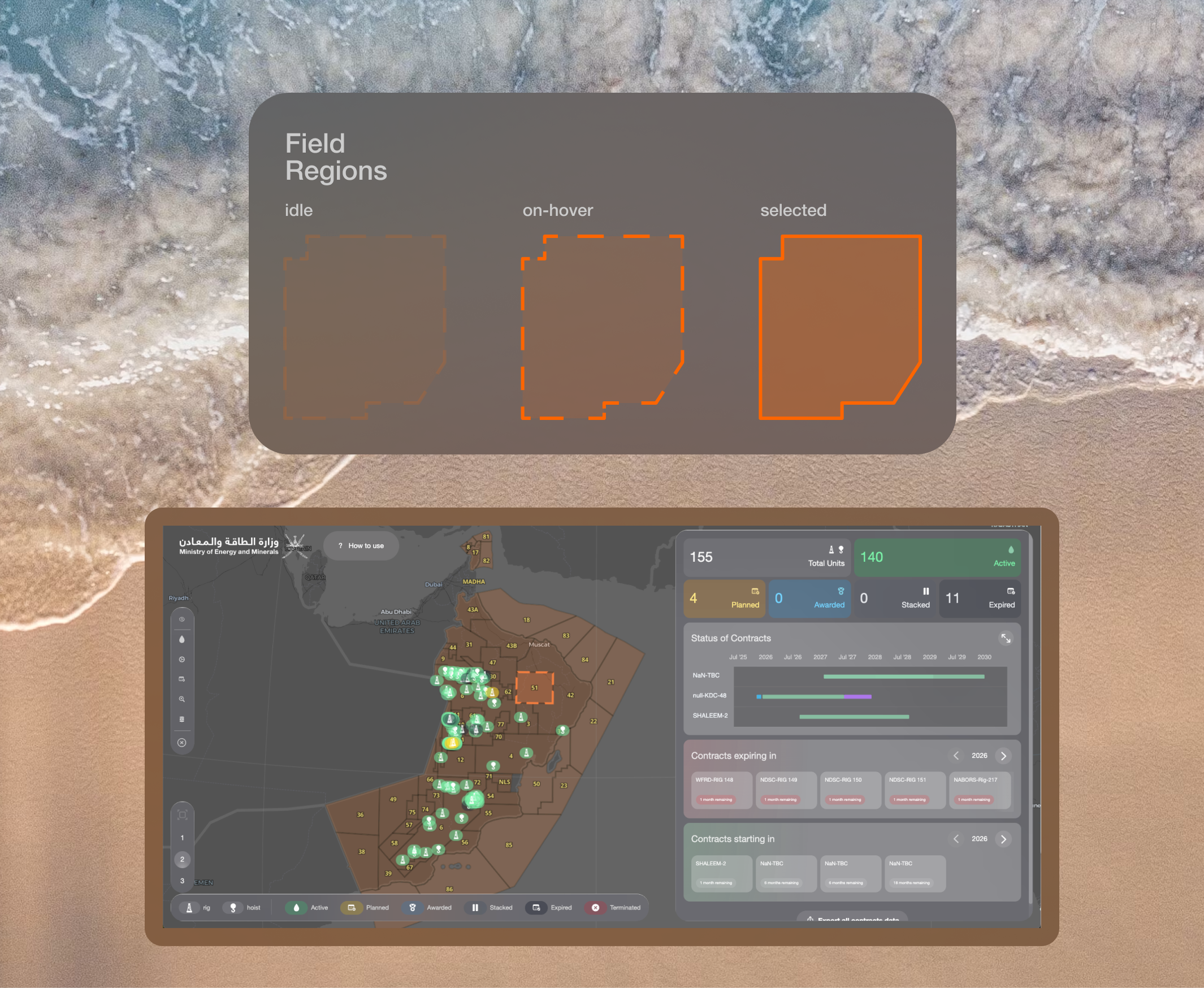
The source map existed as an SVG. To make each block selectable and connect it to live information, I provided the development team the JSON that would allow to easily map it to the globe.
I worked with the front-end developer to define how the blocks should behave across default, hover, selected, and filtered states.
The result turned a static industry map into one of the dashboard's primary navigation tools.
Working as a small team
The delivery team consisted of a project manager, one front-end developer, one back-end developer, and me as the product designer.
The small team made communication direct. Design and development decisions could be discussed quickly, and we were able to adjust the interface as technical constraints became clearer.
Our project manager had already established strong trust with the client. During the initial discovery sessions, MEM communicated its needs clearly and gave the team room to make informed product decisions without requiring approval for every detail.
That autonomy was valuable under the two-week deadline.
Building under an uncertain deadline
We successfully produced the initial prototype within the symposium timeline, but doing so required some deliberately scrappy implementation decisions.
The dashboard was ultimately not presented at the event.
That change revealed an important issue. Some early technical decisions had been made for a short-lived demonstration, but the same implementation was now becoming the foundation of a longer-term product.
As development continued, those shortcuts began to limit both the front-end structure and the way information could be handled by the back end.
In hindsight, the team needed an explicit decision at the beginning:
Were we building a presentation prototype, or the first release of the production product?
Treating those as separate delivery tracks would have allowed us to move quickly for the symposium without carrying temporary architecture into the long-term dashboard.
Supporting first-time users
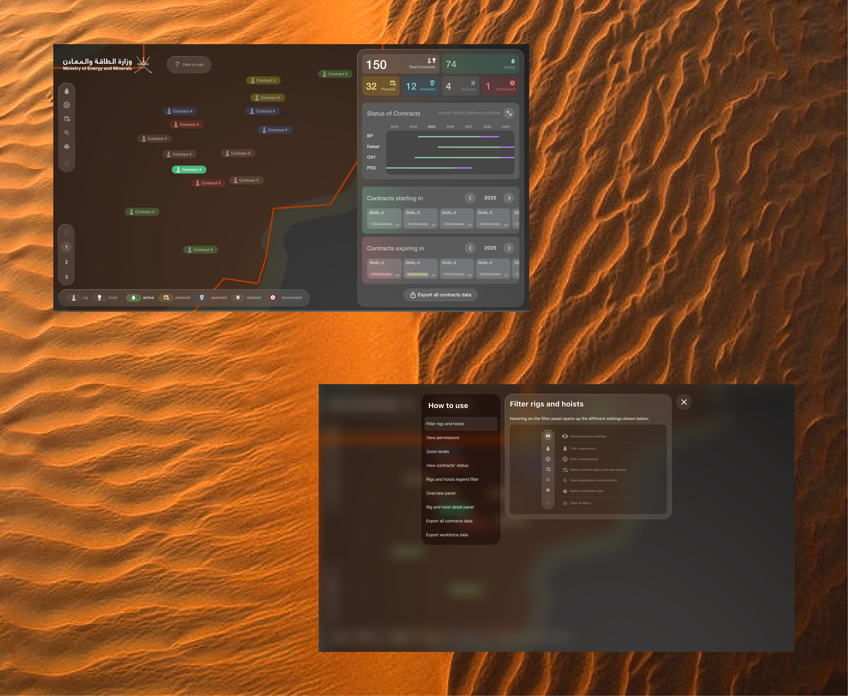
As the product expanded, it became clear that the number of states, filters, and map interactions could be unfamiliar to someone opening the dashboard for the first time.
I proposed an interactive walkthrough that introduced the interface within the product rather than relying on a separate manual.
The walkthrough was later added to the dashboard. It guides users through the main controls, explains the contract states, and shows how to move from the national overview to individual contract information.
What this project taught me
This project reinforced the value of learning a system before attempting to simplify it.
The contract lifecycle initially appeared to be one data point among many. Once we understood its connection to workforce planning, it became the central idea around which the dashboard was organized.
It also changed how I think about rapid prototypes.
A prototype built for presentation and a first version built for continued use may look similar on the surface, but they require different technical decisions. Future projects need a clearer agreement on what the initial build is expected to become.
The strongest outcome was not only the visual direction. It was turning a specialist operational process into an interface that made contract movement easier to understand, explore, and act on.