PDO Intranet Revamp
Sep 2025
How PDO improved its employee intranet experience through a research-led redesign
- Role
- Design lead
- Team
- Design lead, UX Designer, and Project Manager
- Timeline
- April 2025 - July 2025
- Client
- Petroleum Development of Oman
A little about me
I am a product designer with a background in industrial engineering. That background shapes how I approach unfamiliar and operationally complex products. I first learn how the system works, identify the decisions people need to make, and then design the interface around those decisions.
While Oil & Gas can feel overwhelming given the vastness of the industry and the decades-worth of behaviors that have been established, revamping an intranet was an exciting proposition to create impact at scale.
The brief
Petroleum Development Oman is the leading exploration and production company in the Sultanate of Oman. It delivers most of the country's crude oil production and natural gas supply.
With more than 9,000 employees, PDO reached out to Rihal to improve the internal intranet experience for employees and contractors.
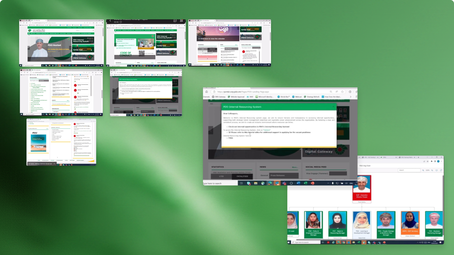
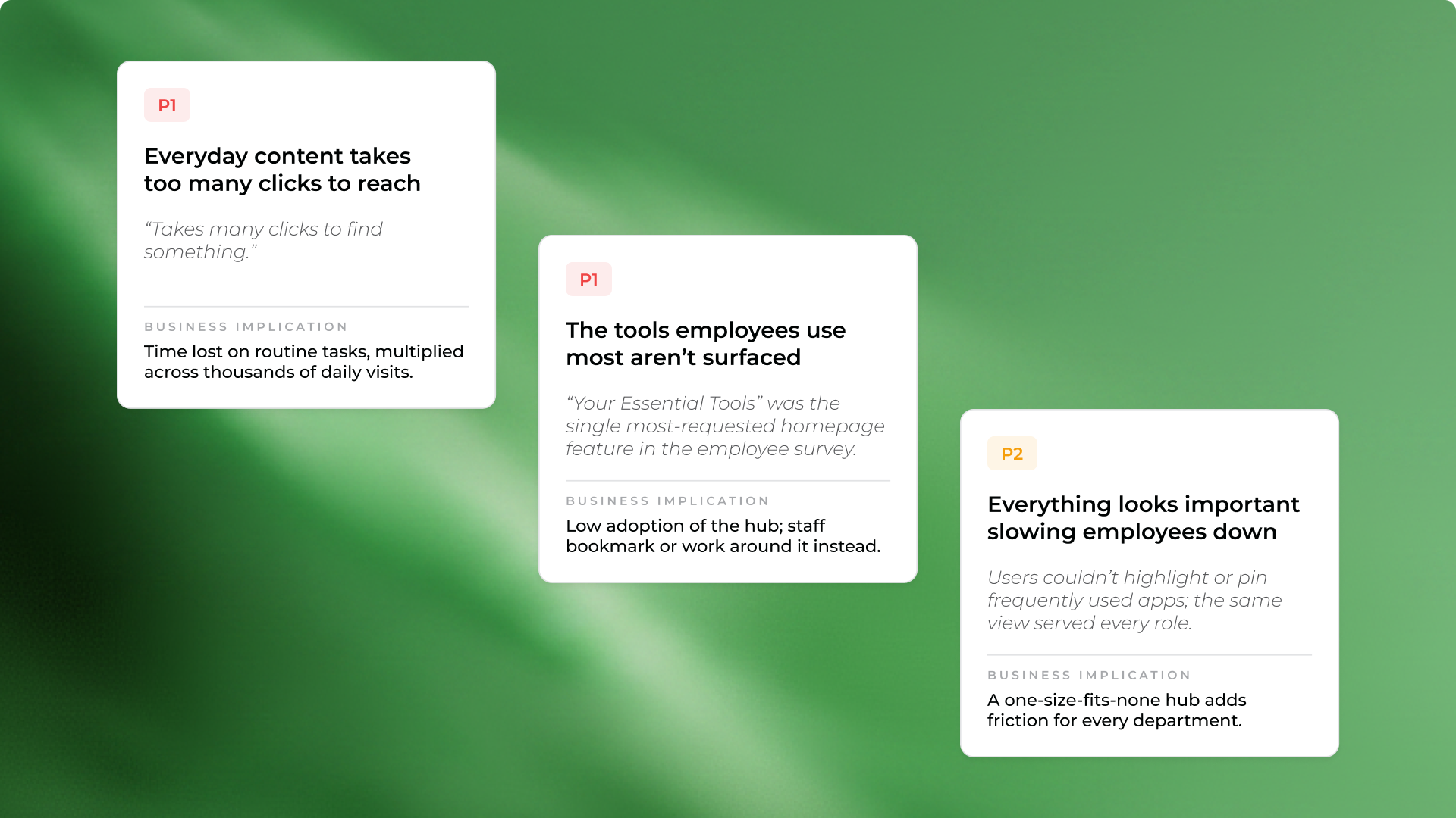
The intranet still worked, but it had become slow and difficult to use. Everyday content took too many clicks to reach. Important tools were hard to find. Old pages, broken links, and inconsistent content made it harder for employees to trust what they were seeing.
The project started as an intranet revamp, but it quickly became clear that a visual refresh would not be enough. We needed to understand how employees used the intranet, where they were getting stuck, and which changes would create the most value.
The challenge
PDO’s intranet, known internally as the Digital Gateway, is the daily starting point for thousands of employees. It contains company news, tools, services, documents, applications, announcements, and key internal information.
Over time, the experience had become harder to manage and harder to use.
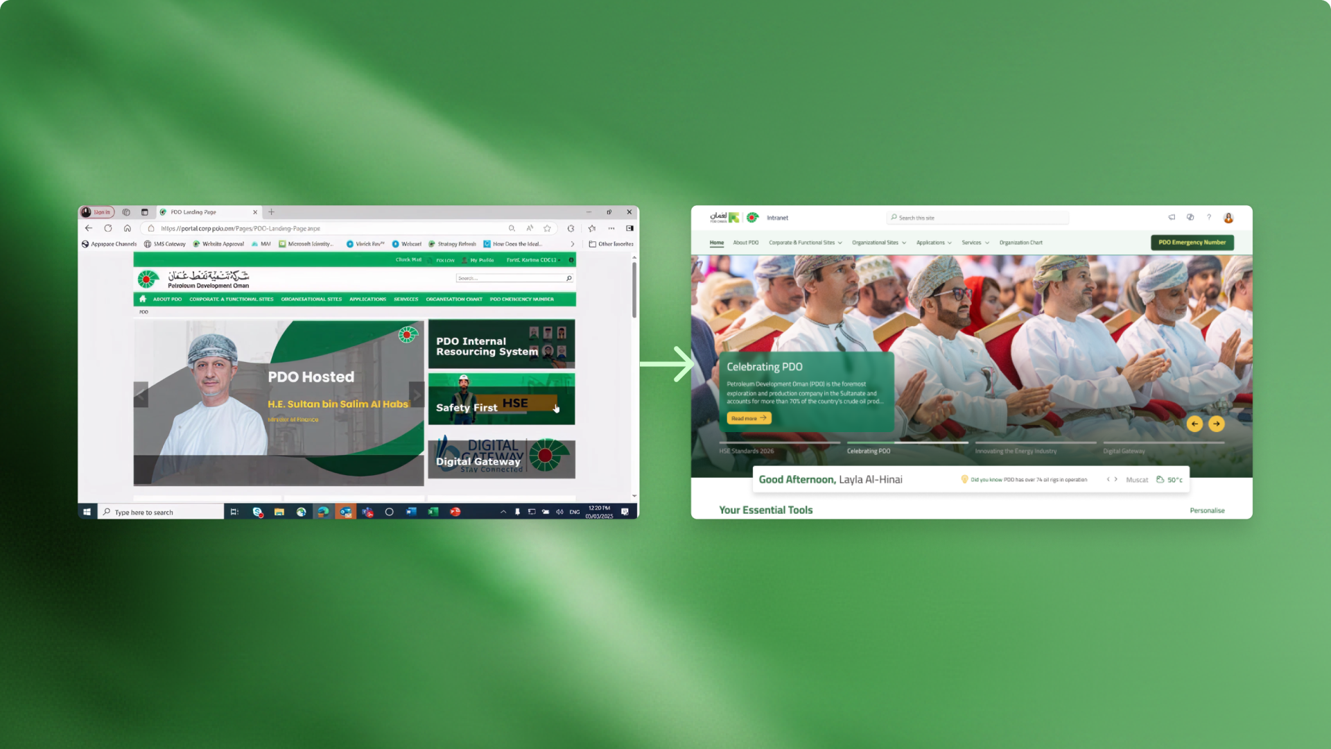
The visual design felt like an older corporate portal. New pages and sections had been added over the years, which created inconsistency across the intranet. Employees were not always sure which information was current, which links still worked, or where to go for common tasks.
The HR team had already surfaced some of these issues, but we needed a wider view. For the redesign to be useful, we had to listen to employees and contractors across the organization, not only the main stakeholders.
Why research came first
One of the first challenges was aligning stakeholders on the process.
Some stakeholders saw the revamp as a graphic design upgrade. From their perspective, the intranet needed a cleaner look and a more modern homepage.
The deeper issues were not only visual. The intranet also had problems with structure, navigation, content ownership, accessibility, and trust.
So before designing screens, we focused on research and audit work. This helped us avoid guessing and gave the redesign a stronger foundation.
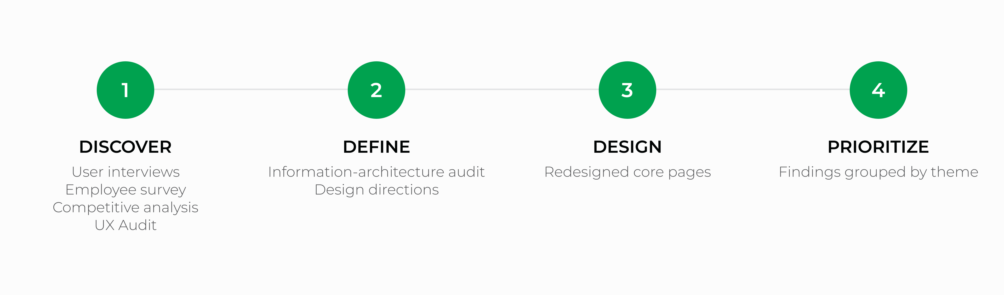
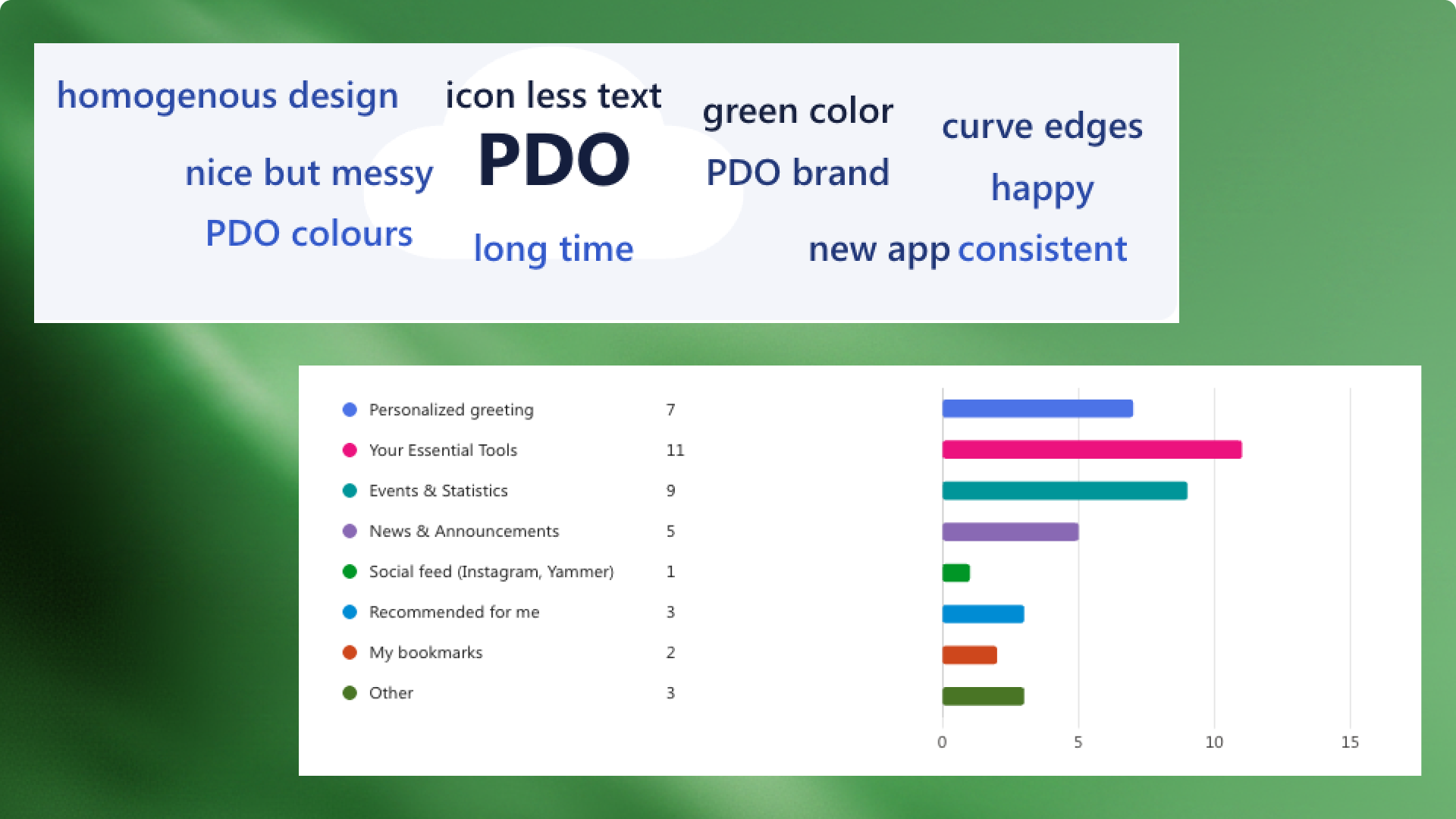
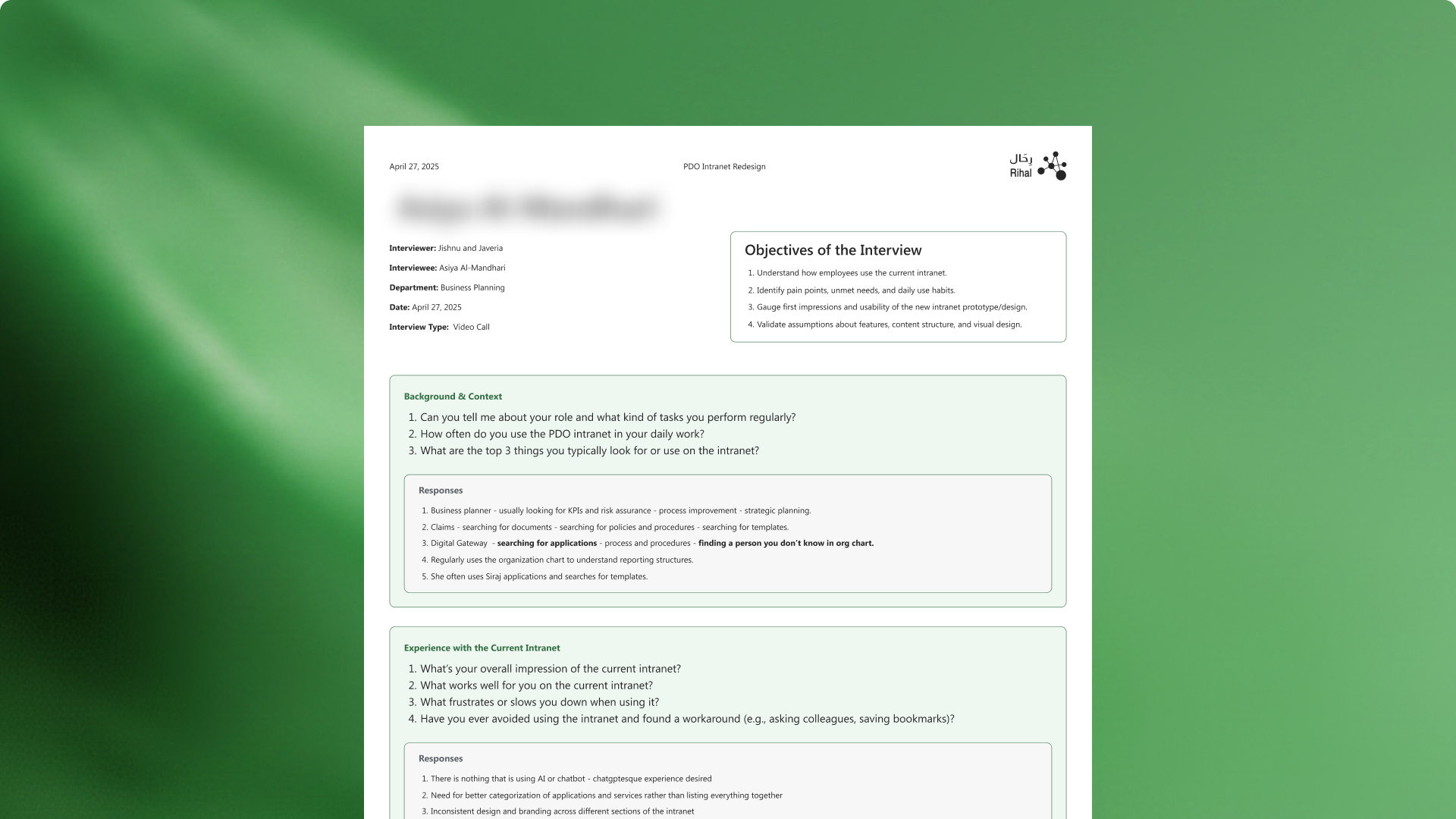
Our process included competitive analysis, a review of the current sitemap, a proposed new sitemap, an employee survey, and user interviews with employees and contractors.
This helped move the conversation from opinions to evidence.
What we found
The research showed that employees were losing time on small tasks that happened every day.
Everyday content took too many clicks to reach. Frequently used tools were not easy to find. The homepage did not clearly prioritize what mattered most. Old links and outdated pages reduced trust in the intranet.
The issue was not that the intranet had no content. It had too much content without enough structure.
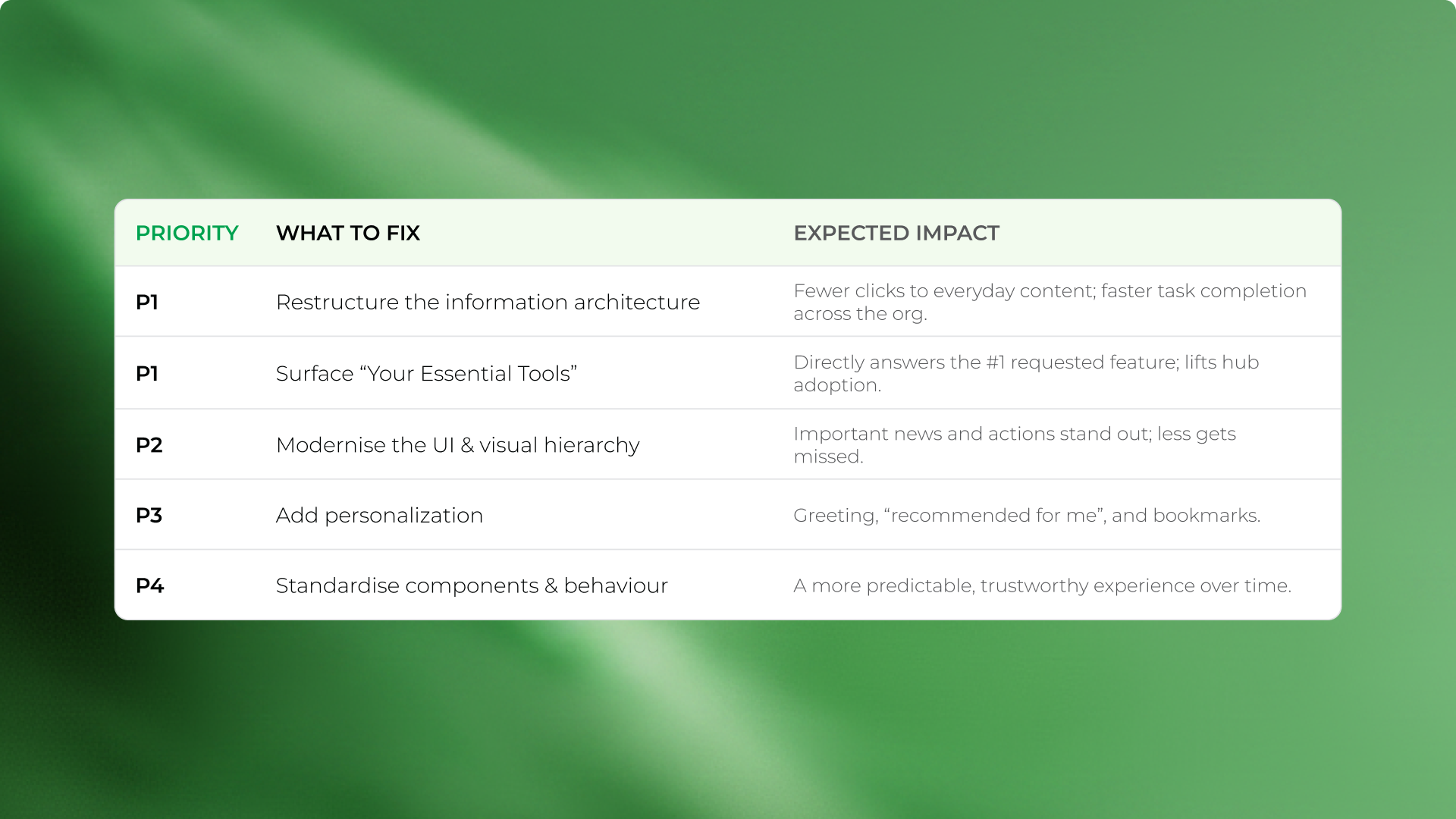
This gave us a clearer design direction. The redesign needed to reduce friction, surface essential tools, create a stronger hierarchy, and make the intranet feel more reliable.
Designing within SharePoint
The intranet had to stay within SharePoint, so the redesign needed to be realistic for PDO’s internal team to build and maintain.
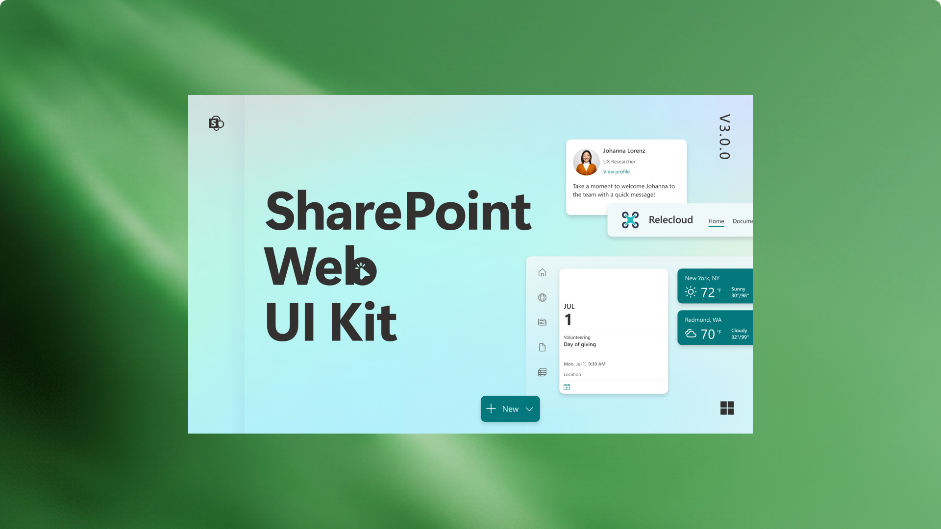
To support this, I used SharePoint’s design system in Figma. This helped us move faster and avoid designing pages that would require heavy custom code.
The goal was to improve the experience while staying close to what PDO’s IT and development team could implement.
This constraint shaped the whole design approach. Instead of creating a concept that looked good but would be hard to build, we worked within the system and improved the experience through structure, hierarchy, layout, and clearer content patterns.
The redesign
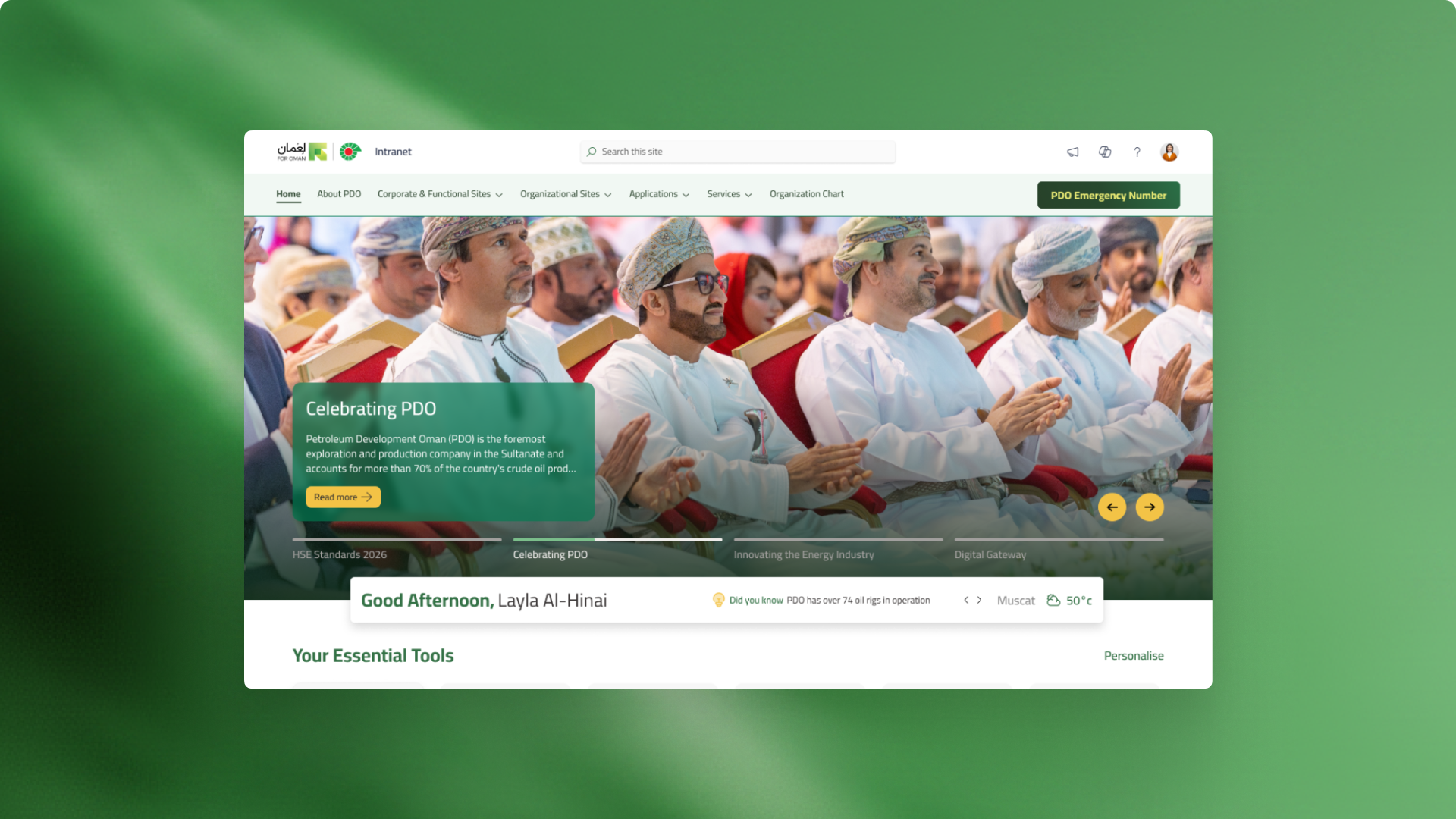
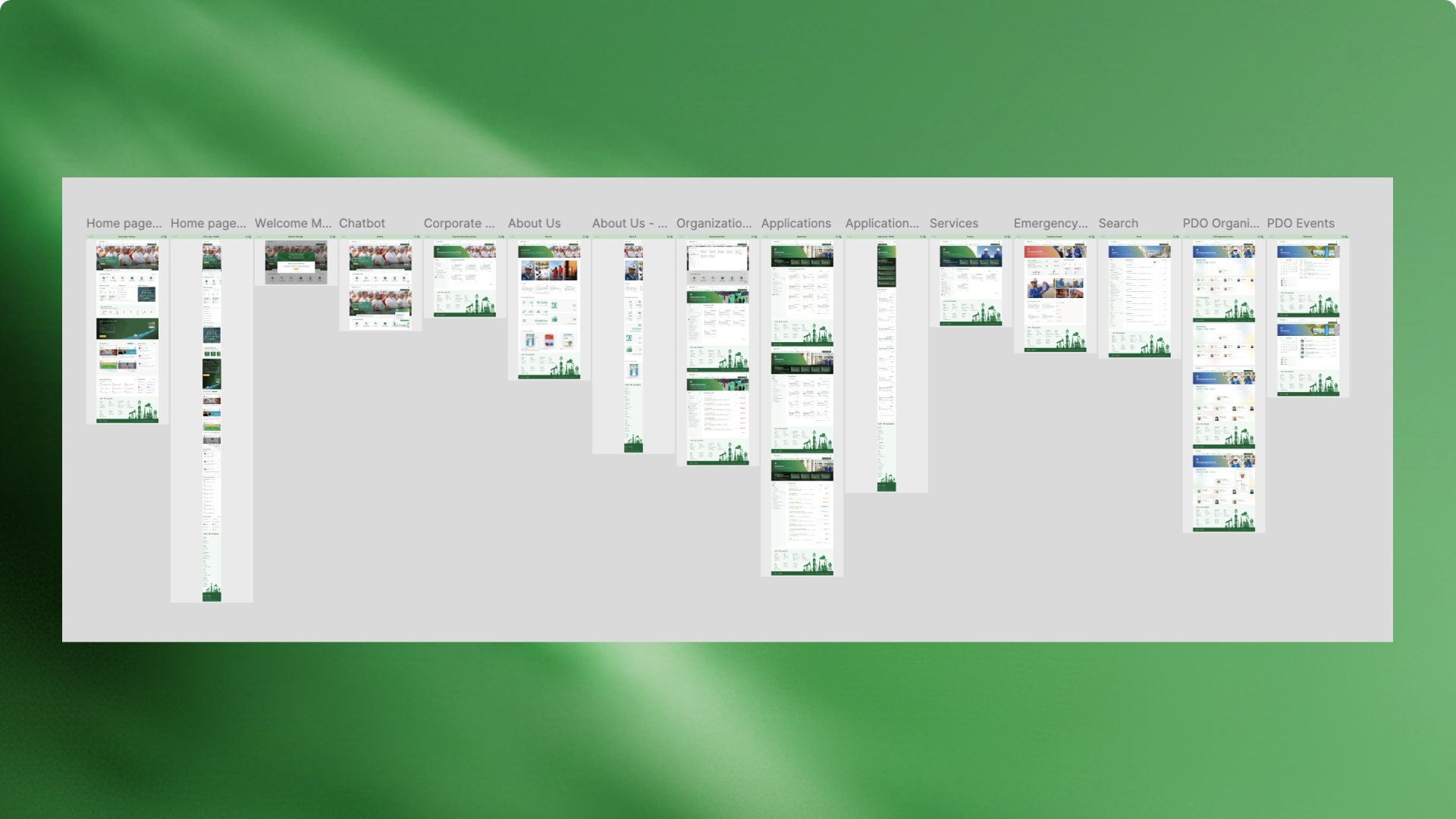
The redesign covered the core pages of the intranet, not only the homepage.
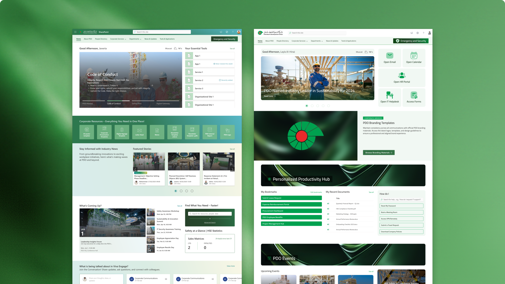
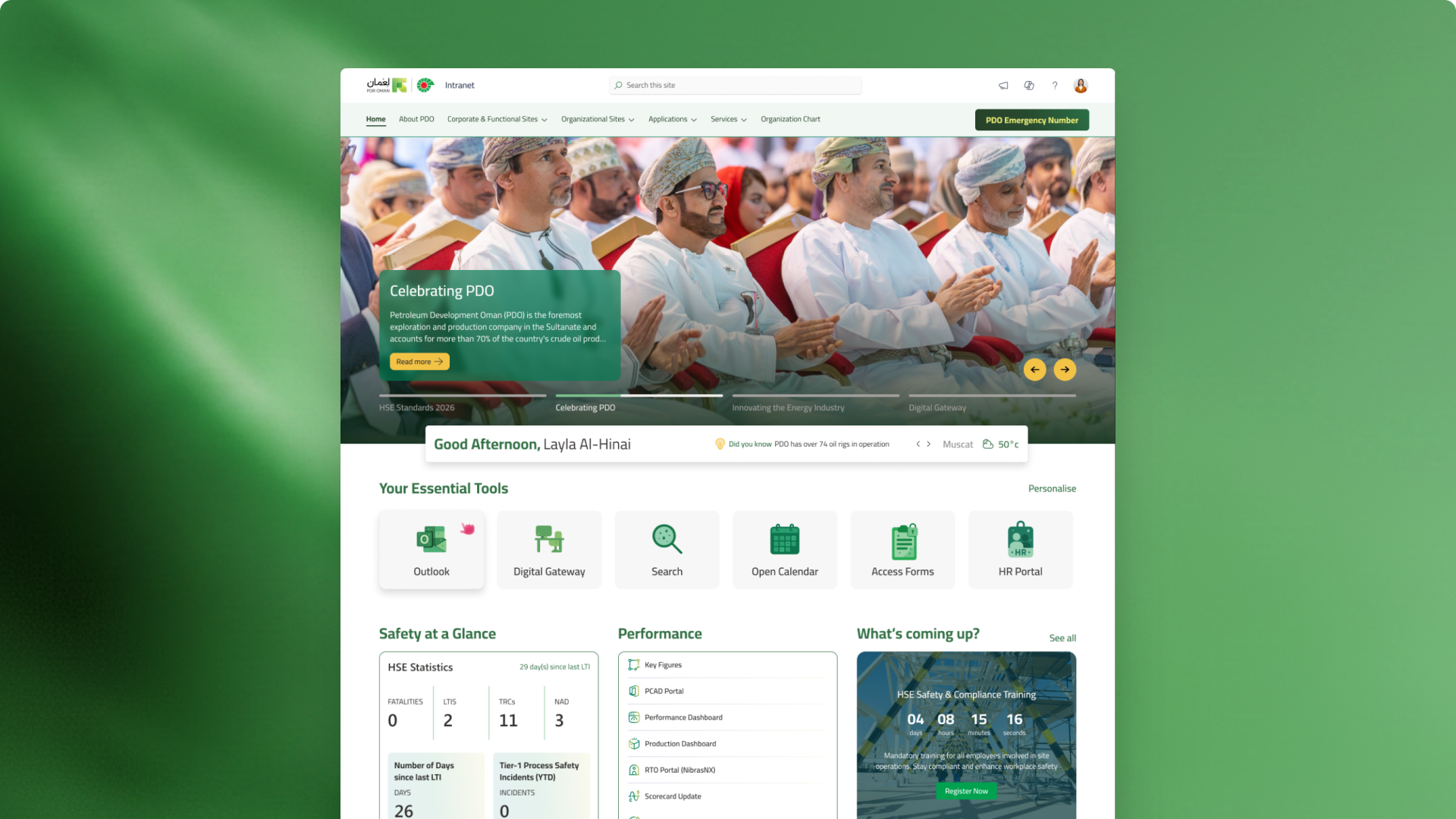
The new direction focused on making the intranet easier to scan and easier to use. Essential tools were brought closer to the surface. News and announcements were given clearer hierarchy. Pages were structured with more consistent components. The overall interface felt more modern while still fitting within SharePoint.
The homepage became a clearer starting point for the day. Core pages followed the same system, so employees could move through the intranet with less confusion.
The final design work was prepared in Figma and handed off to PDO’s development team for implementation.
Elevating the design with illustration
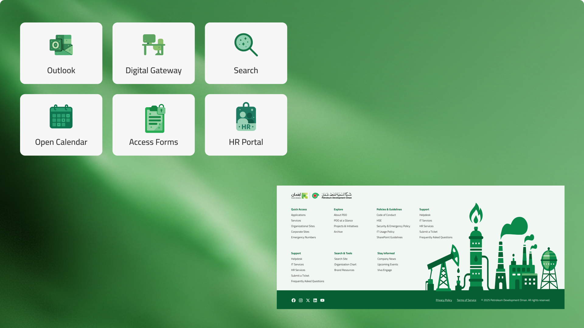
While out of scope, the redesigned pages felt bland and the stakeholders were feeling there was opportunity and room to add visual interest to the homepage. With their feedback and PDO’s branding in-mind, I created the icons and the footer illustration using a combination of ChatGPT and Illustrator. This addition was well-received and left a strong impression, adding to the overall visual refresh.
Reflection
This project reinforced that an intranet redesign is not just about making pages look newer.
For a large organization like PDO, the intranet is part of the working day. It affects how employees find tools, read updates, access services, and trust internal information.
The strongest design decisions came from listening first. The survey showed the scale of the issues. The interviews gave those issues context. The sitemap and screenshot review showed where the structure was breaking down. SharePoint kept the redesign grounded in what could be built.
The final work gave PDO a clearer path forward: fewer clicks, easier access to essential tools, stronger page hierarchy, redesigned core intranet pages, and a practical Figma handoff for implementation.