Siraaj
Jun 2025
Combining in-house AI POCs from early idea to MVP
- Role
- Product Designer
- Team
- Product Designer, Project Manager, Tech lead, ML lead, ML engineers, FE engineers, BE engineers
- Timeline
- 6 months to MVP
- Client
- For Oman’s private and ministerial entities
A little about me
I am a product designer with a background in industrial engineering. That background shapes how I approach unfamiliar and operationally complex products. I first learn how the system works, identify the decisions people need to make, and then design the interface around those decisions.
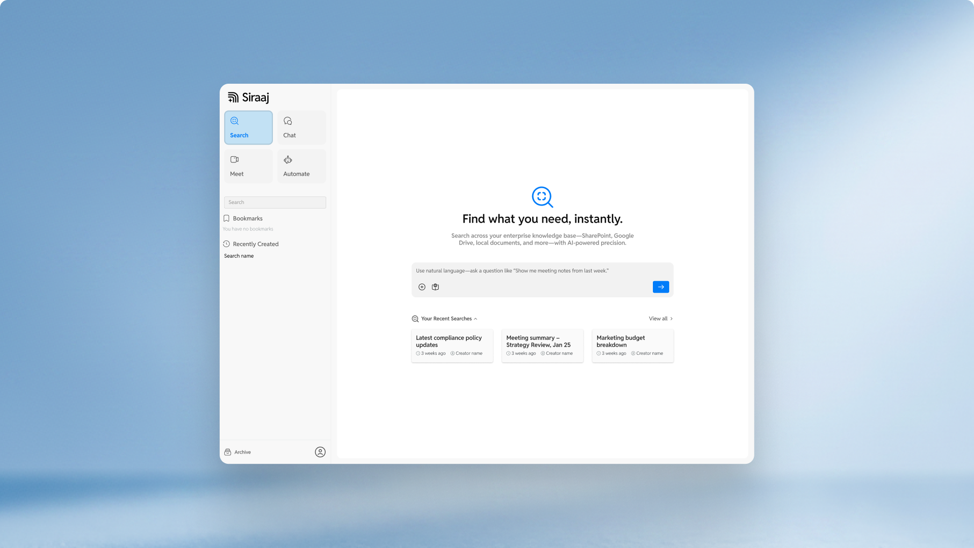
With ChatGPT’s evergrowing popularity and rapid-adoption, Siraaj served as an opportunity to create a bespoke ChatGPT-like experience for Oman with other features from products like Granola, Glean, and n8n as well.
The challenge
Siraaj had to move quickly from internal idea to usable product.
The early product direction was scrappy. There were a few proof of concepts inside Rihal, but they were not yet connected into one clear experience. The opportunity was to combine them into a stronger product with AI as the layer that brought everything together.
The challenge was not only design execution. It was product clarity.
Different stakeholders had different ideas of what Siraaj could become. Some saw it as an AI search tool. Others saw it as a ChatGPT-like assistant for documents. Others were interested in meetings, automation, or enterprise workflows.
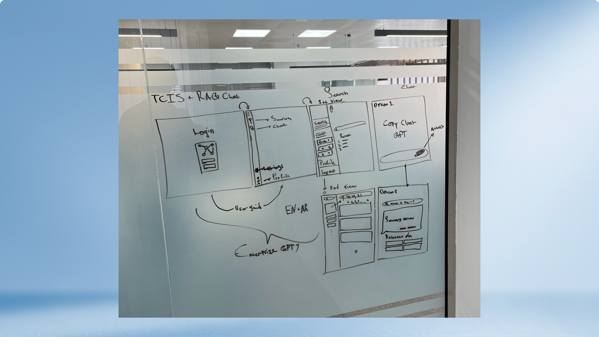
To move forward, we needed clear visualizations, clear user journeys, and enough product structure to remove doubts early.
Shaping the product direction
I worked directly with Rihal's Head of Product through brainstorming and ideation sessions to shape the first version of RihalAI (now known as Siraaj) alongside the CEO and CTO
The most important part of this phase was making the product visible.
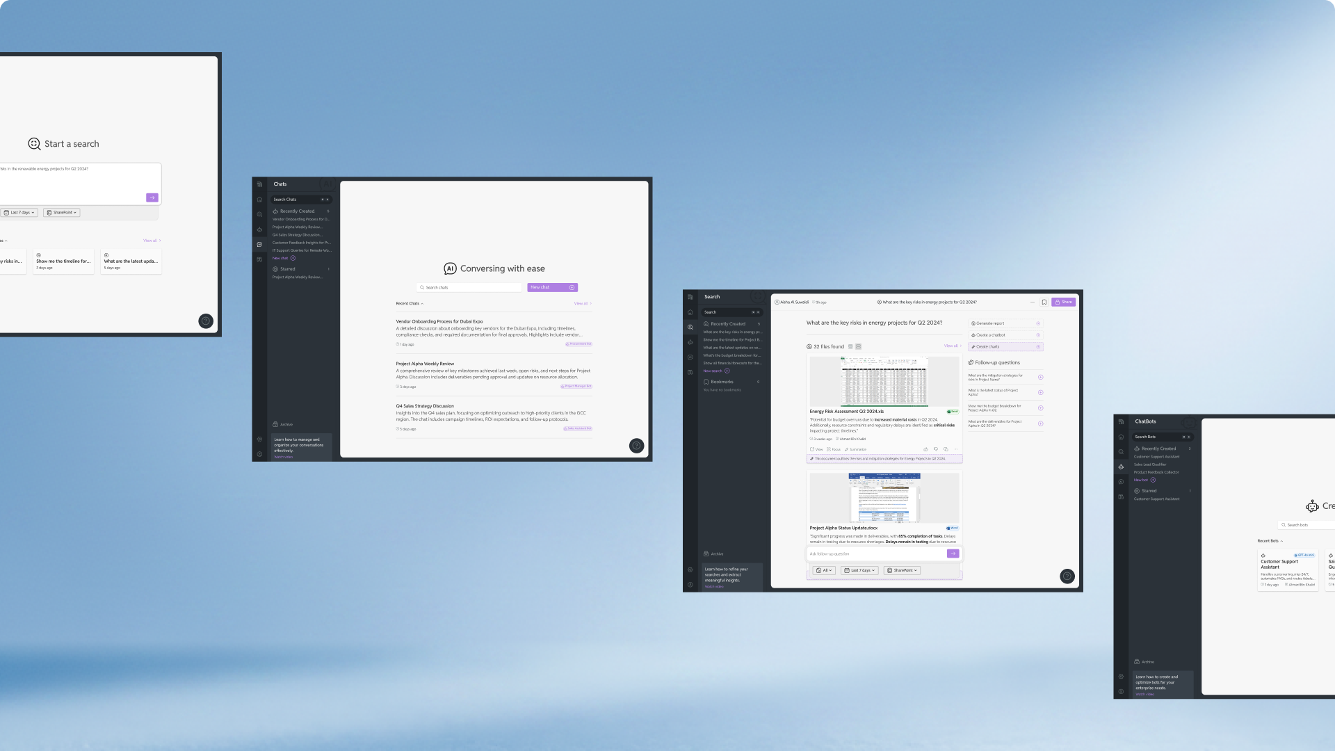
Instead of keeping ideas abstract, I helped turn product discussions into interface screens, key flows, and clear feature concepts. This helped stakeholders understand what Siraaj was, what it was not, and how the first version could work.
The early Figma screens became alignment tools. They helped reduce assumptions, clarify scope, and make the product easier to discuss with internal stakeholders.
Designing the MVP experience
Because the timeline was tight, the design process had to be practical.
A lot of the early design direction was influenced by existing products in the AI space. There was not enough time to move through a long sketching and wireframing phase. The focus was on creating high-fidelity screens that could help the team move faster.
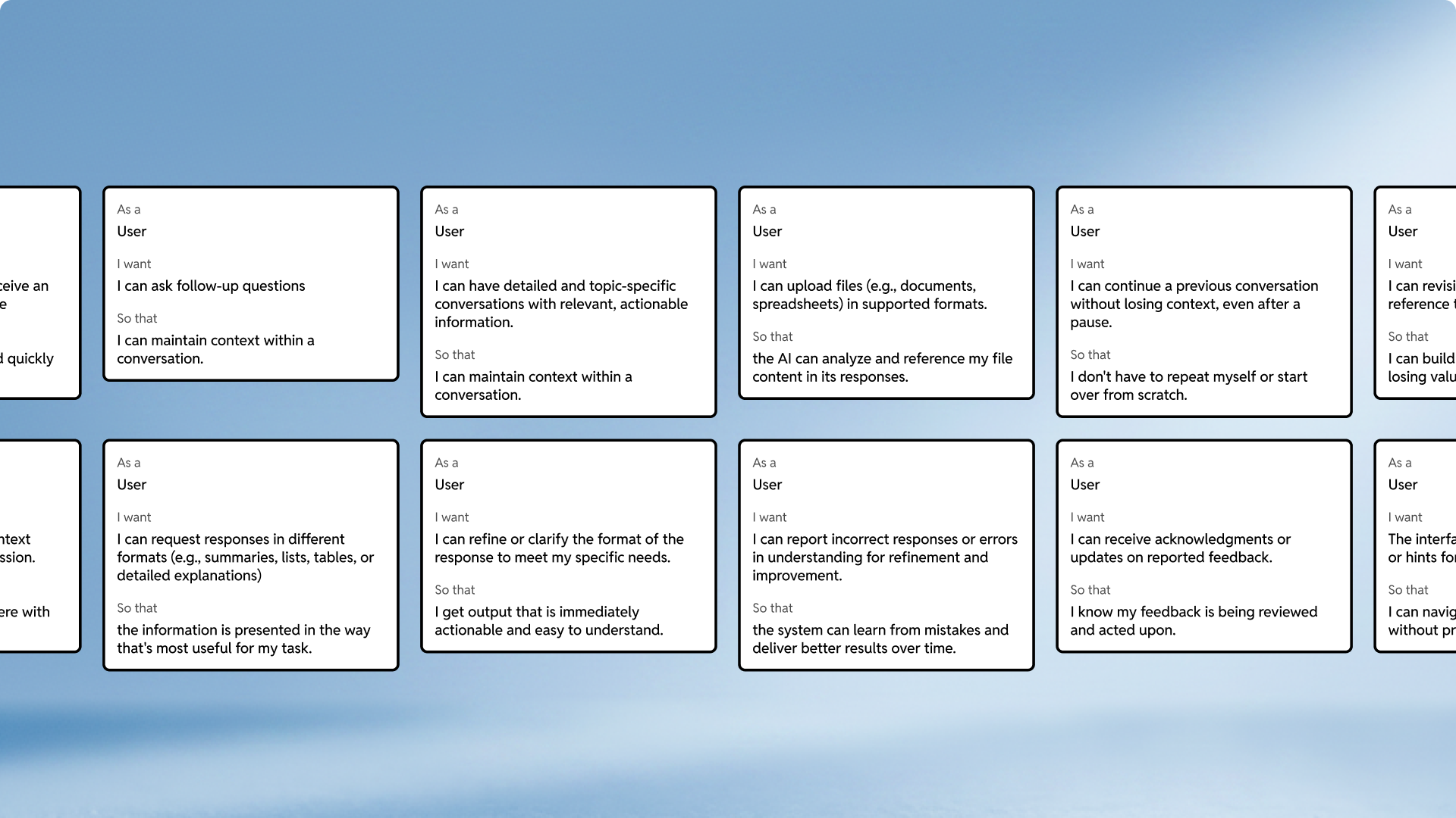
Even with that constraint, the user experience still needed a strong foundation.
I defined the key user journeys for each major feature so the product could scale beyond the first MVP. This helped turn Siraaj from a set of AI features into a more connected product experience.
The user journeys gave the team a clearer view of how someone would search, ask questions, review sources, join meetings, receive summaries, and use automation tools.
The four core modules
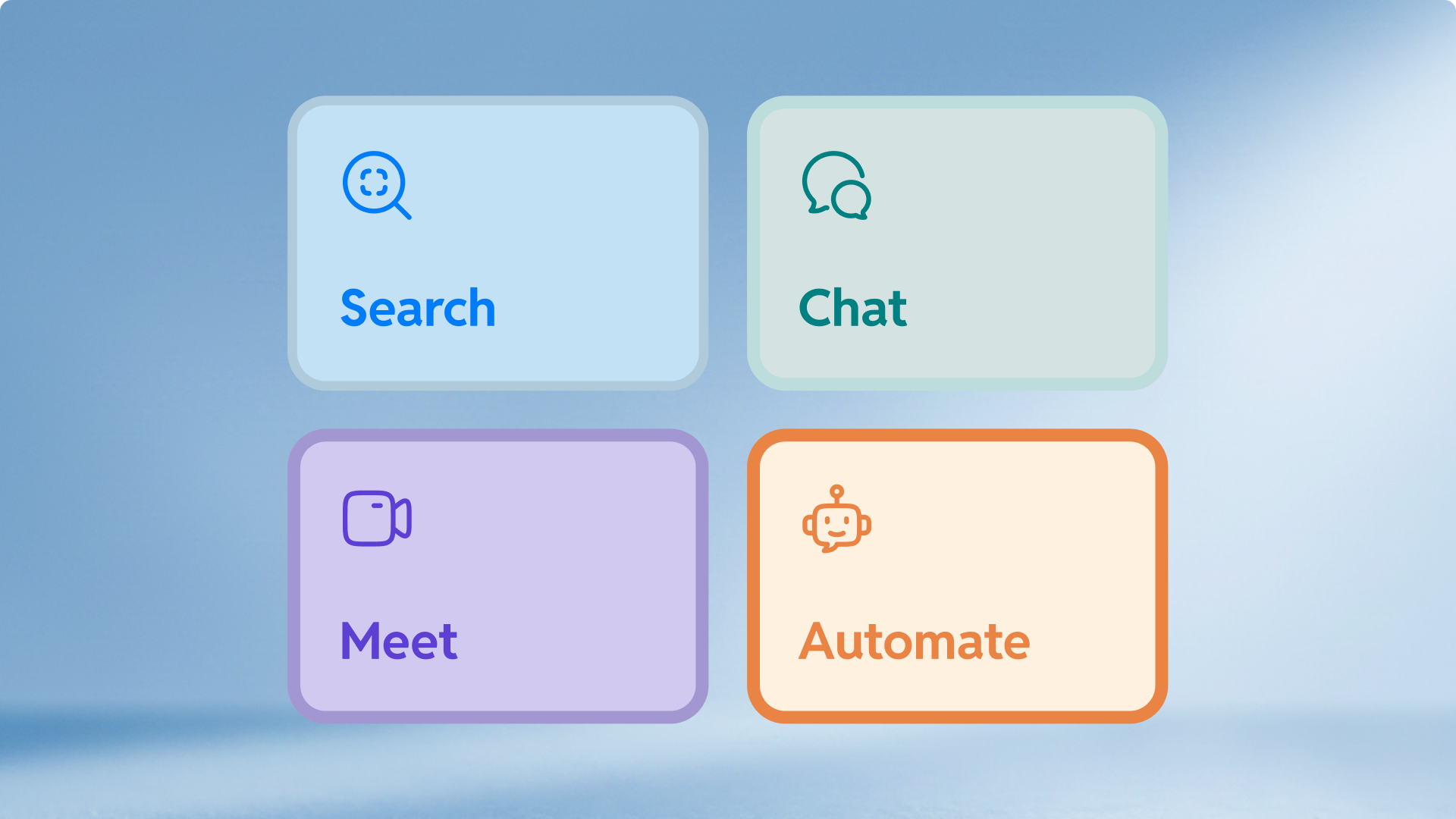
Siraaj was shaped around four core modules.
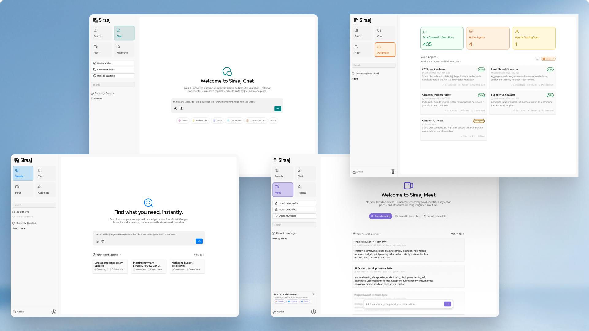
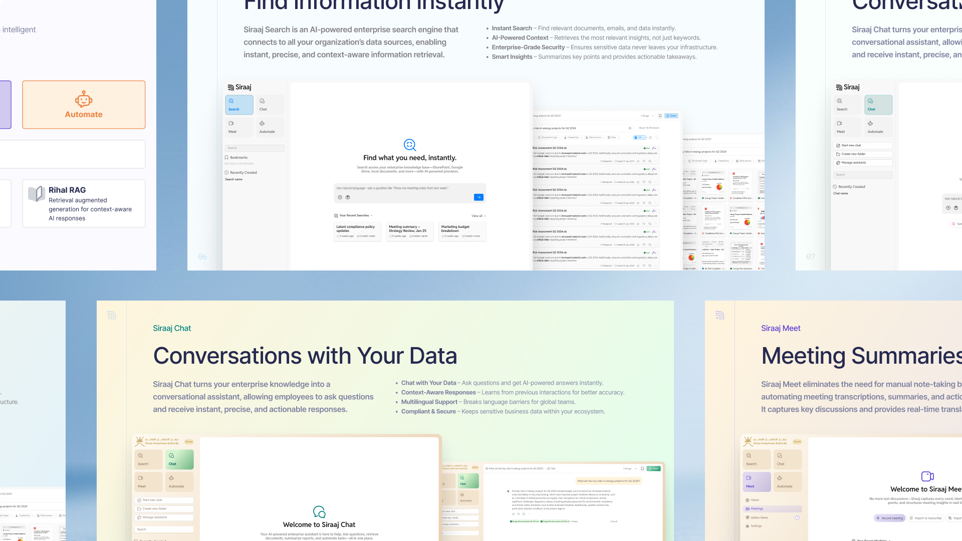
Search helps users explore internal documents with AI-assisted retrieval. Instead of browsing folders or relying on exact file names, users can search across organizational knowledge and find relevant material faster.
Chat gives users a familiar AI assistant experience, but with answers grounded in their own documents and internal context.
Meet improves online meetings with AI transcription, summaries, action items, and live translation. It helps teams reduce manual note-taking and keep better records of what was discussed.
Automate allows users to deploy AI-powered workflows for tasks such as document processing, email categorization, supplier comparison, and risk alerts.
Together, these modules positioned Siraaj as more than a chatbot. It became a platform for enterprise knowledge work.
Designing around Onyx
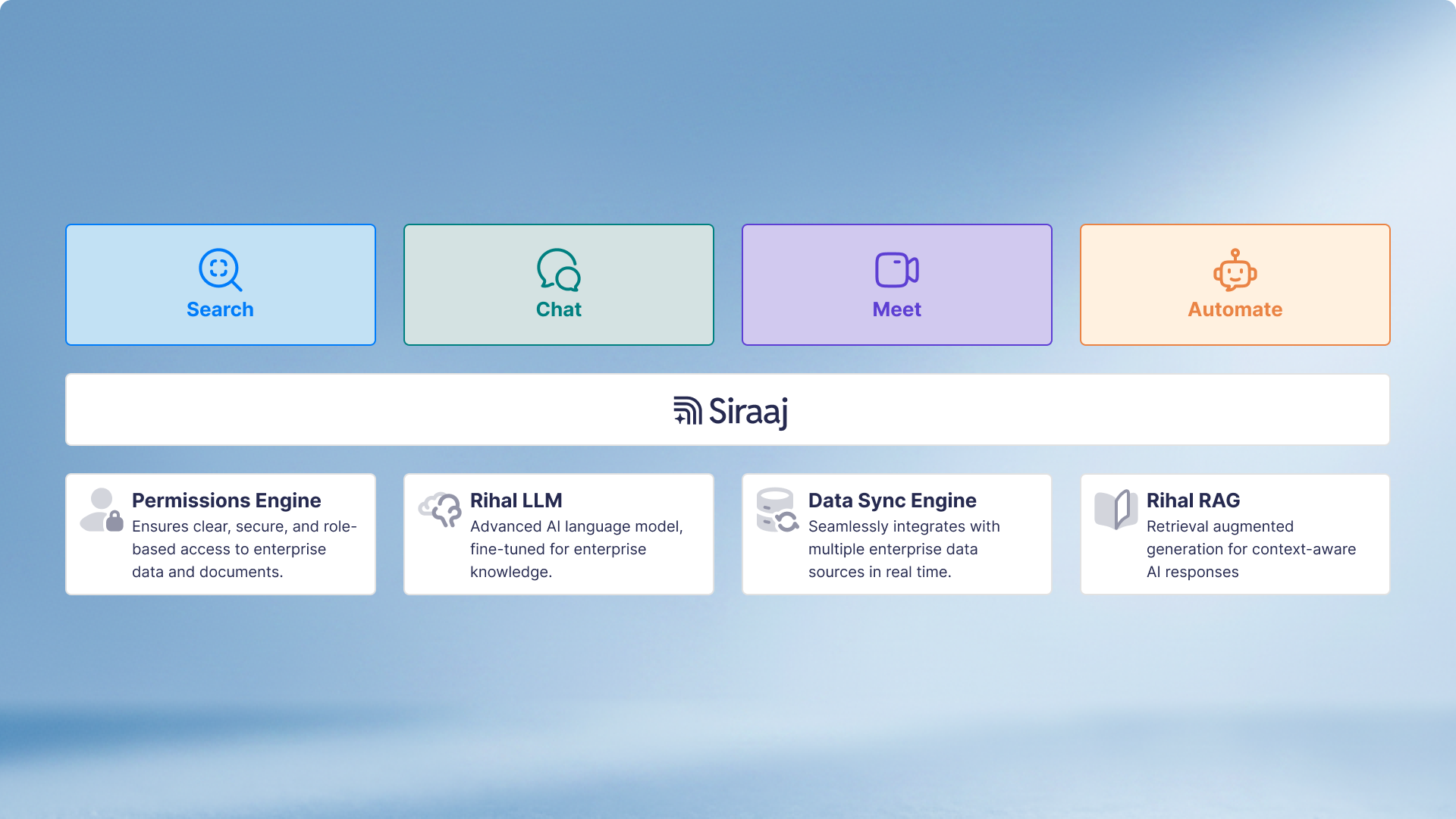
One of the key technical decisions was to use Onyx, an open-source enterprise AI research platform.
This helped the team move faster. It gave front-end developers a base UI to work from and helped the back-end team integrate document search and AI functionality more quickly.
The tradeoff was on the design side.
At first, parts of the product felt too close to an existing AI platform. For users familiar with the AI space, the product risked feeling like a white-labeled tool rather than a bespoke Rihal product.
As the MVP progressed, we had to find a better middle ground. The product needed to benefit from Onyx without looking like Onyx.
That meant refining the interface, replacing generic patterns where possible, and creating a more distinct product experience for Siraaj.
By the end of the MVP phase, the product felt more intentional. It still used Onyx as a technical foundation, but the experience felt more like Siraaj.
Brand identity

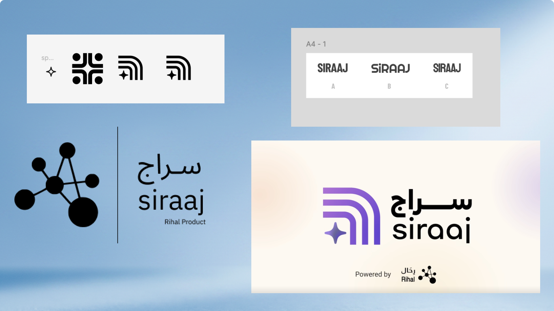
The logo explored the idea of AI moving through deep layers of information to surface what the user needs.
The name Siraaj already carries the meaning of light. The logo extended that idea into a mark that felt sharp, modern, and suitable for an enterprise AI product.
The four-pointed star was important and obvious symbol to leverage as it is common-place in the AI space, but it also worked as a metaphor for discovery, guidance, and illumination.
With that in mind, in an instance that a brand designer rarely experiences, my first pass at the logo was approved.
After the mark was approved, the wordmark was refined by the marketing team with a typography update. This helped make the product feel more ready for public launch and client-facing material.
Internal testing
Before closing the MVP, I ran internal testing with employees who were not directly involved in the project.
This helped us get a less biased view of the product experience.
The goal was to understand whether users could understand the product, move through the main flows, and explain the value of each module in their own words.
The testing helped reveal where the product felt clear and where it still needed better guidance. It also helped us improve the way Siraaj was explained in screens, demos, and pitch material.
| Area | Positive signal |
|---|---|
| Familiar structure | Testers understood the product because it felt close to ChatGPT and common enterprise tools. |
| Large input fields | Search and chat felt obvious because the main action was clear. |
| Left navigation | The nav made the product feel like a real workspace, not a one-off settings page. |
| Recent searches and chats | Users liked having a way to return to past activity. |
| Chat sharing and feedback | Sharing worked as expected for some users, and chat feedback felt useful. |
| Visual direction | The cream, beige, gradient, and soft AI visual language were liked. |
| Grid view potential | Some users liked the grid view, but many wanted richer metadata. |
| Arabic testing | Arabic version seemed to work fine in the tested flow. |
| Theme | What users are saying | Evidence | Product risk |
|---|---|---|---|
| Search results need more meaning | Users do not understand the match percentage, dates, grey previews, file type icons, or what each card represents. | Testers 2, 5, 6, 7, 8, 9 | Search feels less trustworthy, even when results are good. |
| Grid cards are visually nice but under-informative | Users like the grid layout, but it loses detail compared to list view. They want author, creator, connector, file type, knowledge base, date meaning, and richer preview. | Testers 1, 5, 6, 7, 8, 9 | Grid view becomes decorative instead of useful. |
| View behavior is misleading | Users expect "View" to open the document, but it opens a side panel. Some views preview inline, others open a panel or a tab. | Testers 4, 5, 6, 7, 8 | Users feel the product is inconsistent and unpredictable. |
| Chat, search, and assistants mental model is unclear | Users are confused about what Search does versus Chat, what the assistant dropdown does, and why there is a "Search" control inside Chat. | Testers 2, 3, 5, 7, 8, 9 | Users may not understand the core product model. |
| Knowledge base and connector setup needs clearer feedback | Optional fields feel required, duplicate knowledge base errors are unclear, success toasts disappear too fast, and connectors are hard to add in context. | Testers 1, 6, 7, 9 | Users may fail to create knowledge bases and not know why. |
| Sharing and permissions need clearer states | Chat sharing works, but users do not know if shared chats are read-only, who has access, whether the link updates, or how to manage access. Search sharing is not working. | Testers 5, 8 | Sharing can create confusion and trust issues in enterprise settings. |
| Feedback patterns are inconsistent | Chat feedback opens a useful flow, but search feedback is unclear, card-level thumbs feel confusing, and users cannot undo reactions. | Testers 5, 8, 9 | Feedback data may be noisy and users may avoid using it. |
| UI consistency and brand polish need attention | Users noticed inconsistent colors, rounding, logo sizing, input styles, hover states, loading order, and module transitions. | Testers 1, 3, 4, 5, 8, 9 | The product can feel unfinished, even if the features work. |
| Navigation needs simplification | The nav is familiar, but some users feel it has too many actions. Collapse is not obvious. "View all" does not match expectations. Logo is not clickable. | Testers 3, 5, 7, 8 | New users may feel lost before they understand the product. |
| Motion and loading states affect trust | Chat generation jitters, auto-scroll pulls users down, backgrounds load after UI, and loading states are too subtle. | Testers 5, 9 | Users may think the product is broken or unstable. |
| Model and admin controls need role clarity | Temperature is confusing for general users. Model names can mislead users. Some options should be admin-only or better explained. | Testers 4, 5, 8, 9 | Users may misunderstand what they are using or change settings they should not. |
| Visual personality can be improved | Some users want chat to feel more alive, with subtle background movement or a clearer assistant identity. | Testers 6, 8, 9 | Not a blocker, but it affects perceived product quality. |
Pitch and launch material
As Siraaj moved closer to MVP, the work expanded beyond product screens.
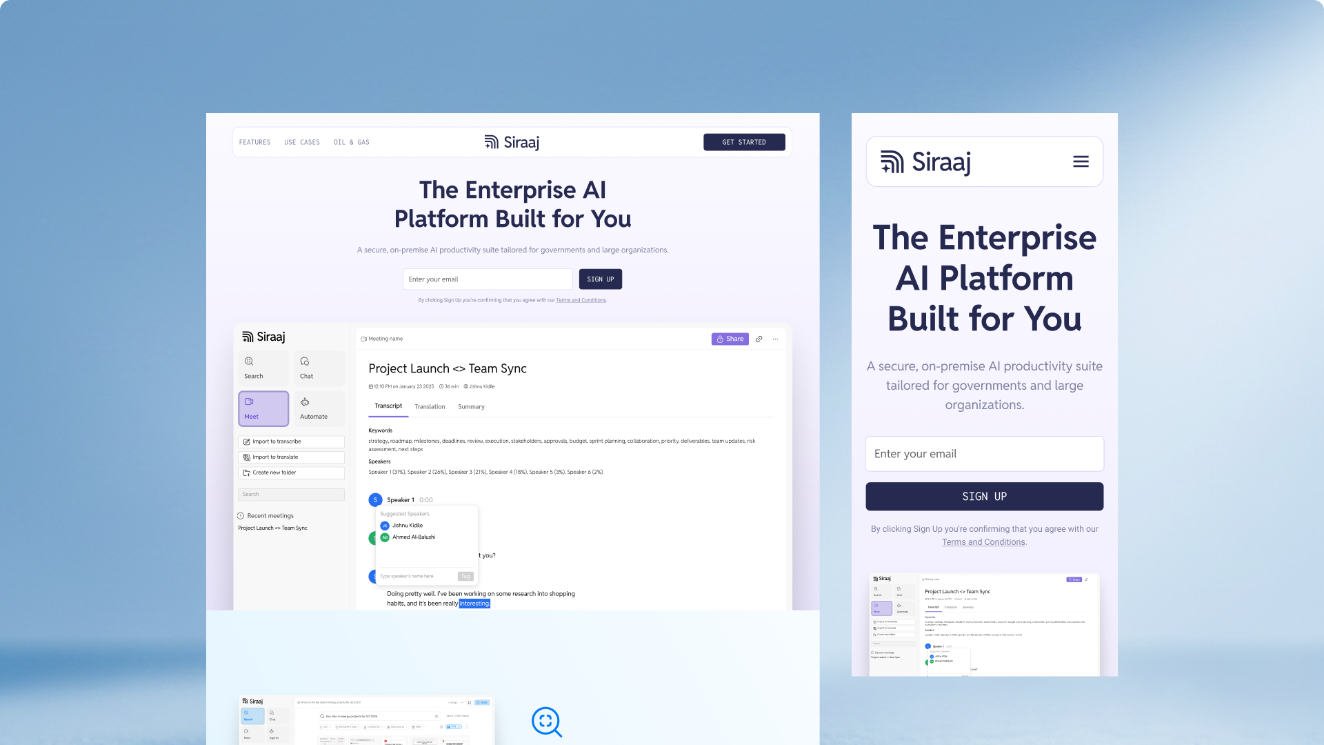
For client pitches, I created and modified slide decks for different audiences. These decks helped explain the product, frame the problem, show the modules, and make the value of Siraaj easier to understand.
Landing pages were also designed for different audiences. These helped position Siraaj for corporate and government clients, while giving the product a clearer public-facing presence.
The pitch material mattered because Siraaj was not only being built. It also had to be sold, explained, and trusted.
What we delivered
The MVP brought Siraaj from early internal proof of concepts into a client-facing AI product.
The work included product ideation, key user journeys, high-fidelity UI screens, user stories, module design, brand identity, internal testing, pitch decks, and landing pages.
Siraaj was prepared for public launch with a clearer product experience and a more complete visual identity.
The product also helped Rihal secure purchase orders from government and private sector entities.
https://www.linkedin.com/posts/activity-7464977473978474496-Ikex
Reflection
Siraaj showed me how product design works when speed, stakeholder alignment, and technical constraints all matter at the same time.
The project did not start with a perfect product brief. It started with scattered proof of concepts, different stakeholder expectations, and a tight timeline.
Design helped make the product easier to see, discuss, test, and sell.
The most important work was not only creating screens. It was turning loose ideas into a clear MVP, shaping the product around user journeys, and making Siraaj feel like a distinct enterprise AI product rather than a collection of AI features.